yes. and the answer is… actually in this thread
I have a similar problem. If I have a non-English language set for my keyboard, shortcuts don’t work, unless I switch back to English. In previous releases it worked, besides for when I was making arrays, the x did not work, if you are anyway making a fix, maybe fix this too? (The other language I have on my computer is Hebrew so yes, based on different characters.)
I have a similar problem. If I have a non-English language set for my keyboard, shortcuts don’t work, unless I switch back to English. In previous releases it worked, besides for when I was making arrays, the x did not work, if you are anyway making a fix, maybe fix this too? [The other language I have on my computer is Hebrew so yes, based on different characters.]
Yes. I found it. Thanks.
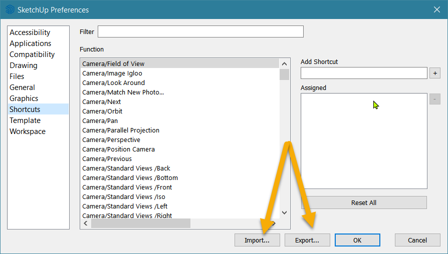

On Mac OS X, you can save your keyboard shortcuts file to your new or other computer. Your keyboard shortcuts are automatically saved in the following location: MachintoshHD/Users/[User name]/Library/Application Support/SketchUp #/SketchUp/Shortcuts.plist
A different way to give the path, so that this can be copied and pasted for any named user, is:
~/Library/Application Support/SketchUp 2022/SketchUp/
That can be copied and pasted into the dialog that appears when you choose Go to Folder… from the Go menu in Finder.
One problem though, starting with SketchUp 2018 the shortcuts, and many other settings, were added to a SharedPreferences.json file. Some other settings were put into a PrivatePreferences.json file. Both are in that same support folder, where Shortcuts.plist used to be.
The format is quite different too. Not just because it’s now JSON instead of XML. Now the shortcut records what combination of control, option, shift, and letter you were using. Here is how the default keys are set for SketchUp 2019:
        "Settings": {
            "Num_Shortcuts": 19,
            "Shortcut_1": "0 0 0   selectSelectionTool:",
            "Shortcut_10": "0 0 0 M selectMoveTool:",
            "Shortcut_11": "0 0 0 Q selectRotateTool:",
            "Shortcut_12": "0 0 0 S selectScaleTool:",
            "Shortcut_13": "0 0 0 F selectOffsetTool:",
            "Shortcut_14": "0 0 0 O selectOrbitTool:",
            "Shortcut_15": "0 0 0 H selectDollyTool:",
            "Shortcut_16": "0 0 0 Z selectZoomTool:",
            "Shortcut_17": "0 0 1 Z viewZoomExtents:",
            "Shortcut_18": "0 0 0 E selectEraseTool:",
            "Shortcut_19": "0 0 0 K toggleDisplayBackEdges:",
            "Shortcut_2": "0 0 0 G makeComponent:",
            "Shortcut_3": "0 0 0 L selectLineTool:",
            "Shortcut_4": "0 0 0 T selectMeasureTool:",
            "Shortcut_5": "0 0 0 B selectPaintTool:",
            "Shortcut_6": "0 0 0 R selectRectangleTool:",
            "Shortcut_7": "0 0 0 C selectCircleTool:",
            "Shortcut_8": "0 0 0 A selectArcTool:",
            "Shortcut_9": "0 0 0 P selectPushPullTool:"
        },
If you are brave enough you could edit the SharePreferences.json file for the older SketchUp, and the one for the new SketchUp, and replace that whole section. If you do, make sure that SketchUp was closed at the time.
One thing to worry about though is that later Sketchup may have more built in shortcuts. Here is the default set for 2023:
"Settings": {
    "Num_Shortcuts": 21,
    "Shortcut_1": "0 0 1   selectLassoSelectionTool:",
    "Shortcut_10": "0 0 0 P selectPushPullTool:",
    "Shortcut_11": "0 0 0 M selectMoveTool:",
    "Shortcut_12": "0 0 0 Q selectRotateTool:",
    "Shortcut_13": "0 0 0 S selectScaleTool:",
    "Shortcut_14": "0 0 0 F selectOffsetTool:",
    "Shortcut_15": "0 0 0 O selectOrbitTool:",
    "Shortcut_16": "0 0 0 H selectDollyTool:",
    "Shortcut_17": "0 0 0 Z selectZoomTool:",
    "Shortcut_18": "0 0 1 Z viewZoomExtents:",
    "Shortcut_19": "0 0 0 E selectEraseTool:",
    "Shortcut_2": "0 0 0   selectSelectionTool:",
    "Shortcut_20": "0 0 0 K toggleDisplayBackEdges:",
    "Shortcut_21": "0 0 1 S showOmnibar:",
    "Shortcut_3": "0 0 0 G makeComponent:",
    "Shortcut_4": "0 0 0 L selectLineTool:",
    "Shortcut_5": "0 0 0 T selectMeasureTool:",
    "Shortcut_6": "0 0 0 B selectPaintTool:",
    "Shortcut_7": "0 0 0 R selectRectangleTool:",
    "Shortcut_8": "0 0 0 C selectCircleTool:",
    "Shortcut_9": "0 0 0 A selectArcTool:"
},
You could carefully copy over only the lines that you have changed (but don’t replace the ‘Shortcut_13’ part), or add in any custom shortcuts you added, then change Num_Shortcuts so that the number is correct.
Manually adding your favorites in the SketchUp preferences might be a safer way to do the migration!
Regarding the new update:
These new icons are absolutely atrocious. This is a major downgrade from the previous icon sets. Does the UI team have something against people with impaired vision? That’s… a sadly genuine question.
I have large icons checked in 2023, and 2023’s large icons are nearly as small as the standard icons in 2021.
Large icons checked in both versions:

Large icons checked in 2023, unchecked in 2021:

This is very concerning to me. Can we at least get actual large icons back? I can stomach the new icons if they were somewhat larger with large icons checked (But still prefer those of the previous version).
On the plus side, I am happy to report the floating tray issue I previously brought up has been addressed with this version! I no longer have to readjust my trays on my secondary monitor to get them working properly, they load and function normally like they used to pre-2023.
Yeah, definitely! Like, this is kind of an example, but:

This is to simulate me when I take my glasses off. In the previous version, I can still distinguish fairly easily the different icons, due to a better choice in color, despite everything being blurry. In 2023? Everything just starts bleeding together, I can’t tell what’s what unless I squint really hard and put my face right up against the screen.
This is a major cause for concern with regards to eye strain and needs to be addressed.
5 Likes
Another thing I’ve come across:
Numpad shortcuts don’t appear to be working? Toggled Num lock on/off, no go. Tried it on at least two different options (Make/Edit Groups and Cleanup Extension) and it doesn’t matter if I set it to Numpad 0, Numpad 1, etc… it’s not working.
The +/- on the Numpad is working though (I have those assigned to Combine/Subtract solid tools).
Edit: Yeah, seems to be specifically just the number keys. +, -, *, . and / work on the num pad.
1 Like
All my life is on NumPad - so this build was thrown to trash immediately
Hi RLGL, Colin,
After this explanation I definitely will do it manually… ![]()
After all it’s 10 to 20 minutes a year. And you also can clean up the list at that moment.
For now I will stick with 2022, I also do not have the nerve to go with the 2023 version…
I went looking to see if the tool icon size was a known issue. I couldn’t see any reports about that.
I did my own screenshots:

Most tools look different now, but measuring the ones that are mostly the same, the new icons were the same height, or at worst one or two pixels smaller.
The UX team members are somewhat sensitive about usability issues, and they were apparently not worried about the slight difference. @kathy_davies has come to the forum a lot of times to get feedback about UI issues. She may be able to say more about whether the tool icons are at the intended size.
I wouldn’t be surprised if my eyes are playing tricks on me due to the differing colors.
I can’t help but feel they’re smaller though; I have my icons setup a certain way in Sketchup, all using custom toolbars for the most part (Oh god is it a pain when I update between versions). When I loaded Sketchup 2023 up after this latest update (I was on a previous version of 2023), there was excess space in between all the custom toolbar groupings, kind of similar to this:
Just using this as reference; the gaps weren’t as large as the ones shown here, maybe half the size of the gaps displayed here (I unchecked Large Icons to get this effect), on both the top bar and side bar.
The fact that there was spacing between my groupings, but no tools were removed, lead me to believe the icons were reduced in size, or possibly the spacing between icons were reduced, making them appear more compact? (Looks like it might be a mix of the two, comparing my sandbox tools between the two versions, which still uses the same icons, but the toolbar is shorter in the new version).
EDIT: Nah… there’s definitely a big enough size difference just overlaying the first six icons in the first two rows of icons:

1 Like
The light blue on grey is a huge leap back in useability if you are over 40! There simply MUST be the option to deal with those who want to read/locate the icons quickly. In retrospect I now wonder whether the blue text in Outliner was also degraded in the last update: it used to be easy to read. (And no - not my eyes! Checked 100% last month ![]() )
)
1 Like
For whatever reason you choose, likely a combination of reasons, I am forced to agree that the I find the updated icons more difficult to quickly see and identify, which is primary job of an icon. Certainly the new Solid Tools are distinguished only by quite subtle differences. They all look like light blue blobs on my screen.
![]()
I understand there is an effort to unify the design vocabulary across the iPad and desktop versions. I use both, but the icons on my iPad Pro which I hold close to my face and touch with a pencil, and the ones that live on my set of large highly scaled desktop displays have very different use cases. This is not a one size fits all solution. At this point I would prefer a single big black capital letter to these solid tools: “S” for subtract “U” for union… An inelegant solution I’m the first to agree, but I don’t need beauty, I like it but I don’t need it, I need quick and sure functionality, I need to know where the buttons are and what they do. It’s a pity the new icons could not at least employ the existing Sketchup Logo blue, which is much darker than the light blue that was chosen and would provide a much better contrast against the white.

6 Likes
Agreed! Having a greater contrast would help Trimblendously.
4 Likes
one or two pixels doesn’t sound much but in percentage its around 5 to 10% compared to the previous icons. Combined with the much reduced contrast, the icons in the toolset - to me - are way less readable.
1 Like
There’s been no mention of the new features anywhere on the forum? I really like the new user made Snaps for groups/components. It’s gonna make working with placing standard components a lot easier. The new magenta plane/ custom plane for the mirror /flip command is nice as well, so there’s more new things now than in the initial 23 release.
1 Like