I have been thinking about the topic for a bit. Work with the coloring, yeah. I feel the lack of color contrast is a little tough and has become an eyesore.
As a user from 2006 I find these icons to be the biggest step back in usability that I can remember. I cant stand them, they feel less precise, less contrasty, I don’t like the aesthetic design either, they are simply not ergonomic. Bring back the previous ones, or at least an option to customise the interface and switch icons back to old style if you like them. They have had a negative impact on my speed using the program. Simply awful, looks un friendly and simply Un-SketchUp like. The old icons were a masterclass in iconography, the new ones are a class in how to ruin that legacy!
*Fictional report (Abstract):
*Any correspondence with reality is purely coincidental.
- User: Don’t you think the new icons aren’t really good?
- Marketing Manager: Perhaps. But what can I say to the CEO’s son who designed it!
.![]()
![]()
That’s all very well but you can’t escape the actual new tool icons.
Not sure what you mean Paul?
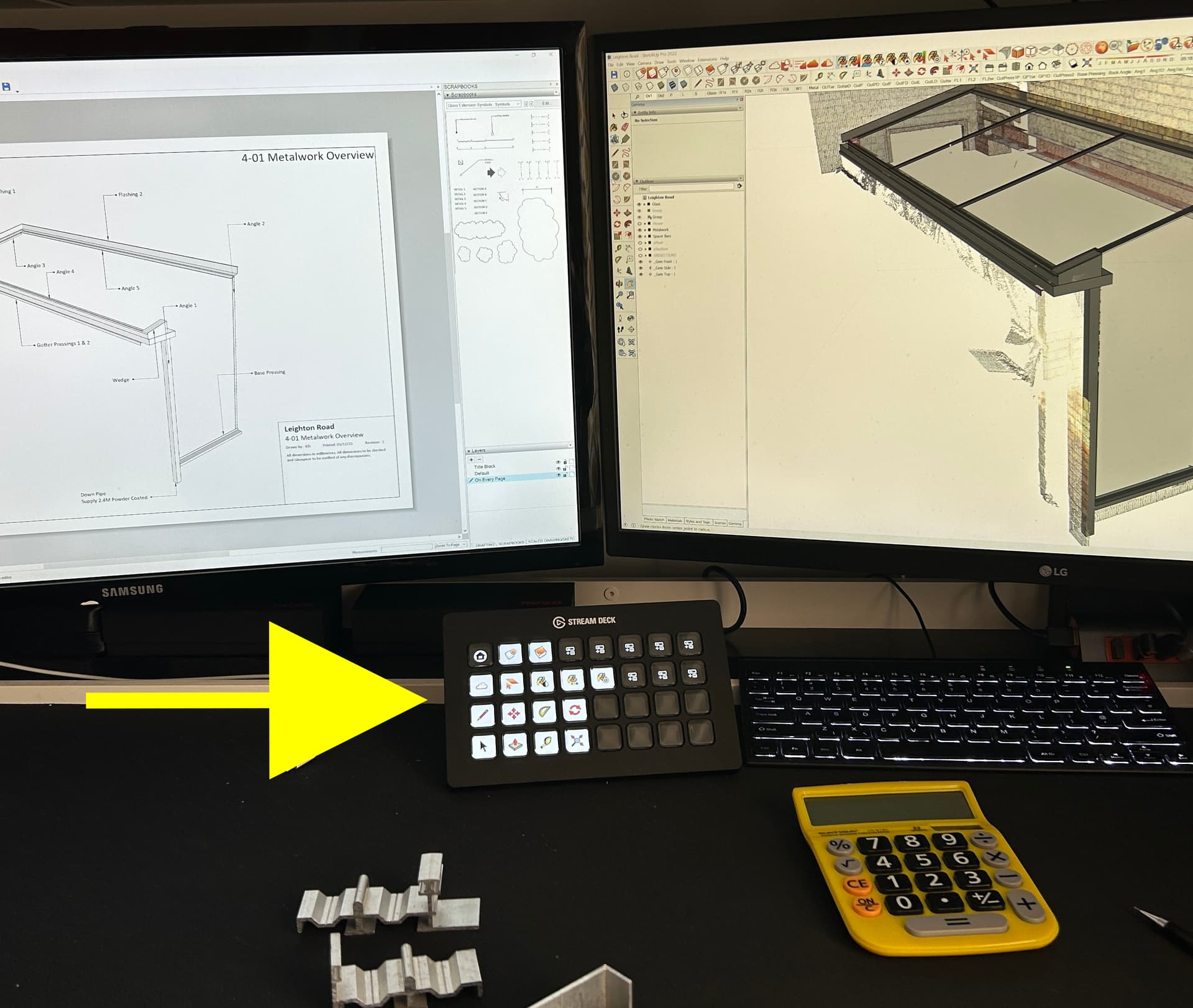
I select my tools from the Stream Deck and I can create literally whichever icon I want to represent each tool I use on there.
Granted - the the icons for whatever version of SketchUp in use will appear on screen but I thought the issue was selecting tools.
Sorry – cursor icons.
Unless you try to get extensions into your workflow to limit the visual damage of the new cursor icons…
Jumping on this bandwagon to add my voice as a Designer with over 10 years of experience in the industry, and over 13 years in SketchUp - I also don’t like the new icons. Not basing my opinion on subjective reasoning but rather an objective one, which has been discussed quite extensively in the thread: all the rules and basic principles of Design have been ignored in the making of these icons, or rather, nothing has been taken into consideration except the need to be consistent with the iPad design.
Well, even the iPad icons fail their purpose because by introducing the Dark Theme, some of the icons nearly disappear on the background, because the dark grey mixes with the blue brand colour of SketchUp badly.
Contrast, Hierarchy, Visual Weight, Visual Scale - none of the most primitive and crucial theories of Design have been upheld. I do not know what the structure of the team behind this redesign was, whether the design was supervised by an Art Director / Lead Artist or whether this decision to keep this was from higher up in Trimble, without wanting to hear about principles of Design. But a friendly, professional feedback from outside the company still stays - icons are badly designed…
Some said this is too small a thing and there are more pressing matters to fix in the first place. I disagree for the following reason: The branding identity (in this case, the visual appearance of the product) is of utmost importance for current and future customers. It is THE thing people see when they first open the program. It is the thing that forms an opinion in the mind of a newcomer, whether he likes the program or not. First impressions matter.
I will see if I’ll be able to find some time to do a small redesign project for the icons, to show how it could have looked. Meanwhile, I guess our only alternatives are but 2 - go back to SketchUp 2022 or replace the icons with the old ones in the system files.
Seems only to work with Layout
20+ Year Sketchup user. I’ve been through many visual changes, and have been OK with every icon change until this last one. I can’t stand it! This nearly monochromatic colorway is difficult for me. Maybe I’m just getting old, but I’m constantly grabbing the wrong tool, and muscle/eye memory isn’t kicking in. Constantly grabbing the “Tag” tool instead of “Eraser”. And so on… DRIVING ME CRAZY!!!
I HATE THIS… Please make it go away.
I think that the developers have about 1723¾ more important issues to concentrate on than some !#¤%&?½§ icons. SketchUp is not yet as “mature” a product as that.
If so, then they could have been left unchanged. To avoid this work load.
I can handle the new icons but prefer the old ones.
(There are many good comments against the change given above).
…but the management still prefers to burn the time and efforts in the Web\Ipad versions, repainting logo from red to blue, renaming layers to tags etc…
I’m sure there was not too much development time involved in this ![]()
you won’t believe…
“Work complicates to fill the available time”
might be interesting read for you:
I am not hating the icons, but that is ONLY because I use keyboard shortcuts.
I didn’t love the old ones, but after 400 years of using them I got used to them. Now: good luck finding the icon you’re looking for. it’s all just a red an blue mess. Just like Google’s app icons nowadays: 45% of the time you click on the wrong app. Whatever.
What infuriated me most is the eraser icon has changed the active corner from the left to the bottom one, besides being humongous, this is so unnecessary. Where the H*** am I clicking?! Bottom corner?WHY?!
Change for the sake of change is the devil’s way of stealing your precious seconds one at a time.
Whoever OK’d this inside Sketchup doesn’t use the software, that’s for sure.
I don’t mind what the icons look like, but I find some of the new ones quite laggy when using shortcuts to toggle in between them… changing from look around to select can take up to a second or two to change (I’m presuming its to do with the new icons?).
sometimes it gets stuck on look around, and other keyboard tools don’t toggle it back to the next one, even select (which I use as an escape tool from all other commands out of habit).
its a bit unnecessary to change the tool bar icons after all this time now that the grey matter has learnt the old ones! But I’ll re-learn - however, the mouse icons for different tools is my main bug bare. as it is causing micro delays and stopping the efficiently of using keyboard shortcuts.
One that subject, I have also had to reassign a few short cuts which combine accelerator keys (mainly alt) as they seem to act differently with the File / Edit / View / Camera etc… which I know has been the subject of other forum discussions.
EDIT: On the topic of sticky mouse Icons, I noticed today, that the select icon doesn’t refresh until the mouse has received some movement - this appears only the case when going from look around to select, whereas other tools can be switched with the keyboard, and the icon on the cursor changes between. Is there a coding reason for this? Its a minor thing! But as I like to use select as a form of escape, it would be great if it had nothing to do with the movement of the mouse to force the cursor icon change.
The new eraser is ridiculous. Can’t figure out where the sweet spot is after two weeks. I’m zooming in to erase anything now.
The pale blue icons are ridiculous.
This is like Windows 10 and 11 level dumb. Reducing utility for no benefit for the customer.
The eraser is the worst! And it’s one of the most frequently used tools.