I’ve noticed a few changes over the years with respect to new tool trays and palettes. For some reason I thought 2023 was supposed to enable a new interface design/approach?
I use 2 trays (left hand side and right hand side) to reduce scrolling across tools/menus. Scrolling or searching through menus takes time and distracts focus from modelling.
I feel like I’m scrolling through trays more than ever in 2025.
SketchUp’s UI design appears to be designed in a way that users are expected to scroll tool trays up and down, to reveal settings and info. This means a lot of hunting around through menus, particularly on projects that have lots of tags, scenes, styles and components.
Working across multiple technical apps, what I notice most about SketchUp is that the menus are very spacious (frames padding around everything). Empty spaces and menus/check boxes that stack vertically instead of side-by-side.
There’s a lot of potential to bring SketchUp in line with other modern interface styles, including that used on this forum, in SketchUp Free, and Trimble Connect. Visually cleaner and more information-dense.
As an example, auto-collapse/shrink space would work very well for palettes like Tags, Components and Styles, and would not interrupt the user experience.
Another thing I notice is that the Font sizes used for SketchUp are often a point or two larger than the default font size for Windows. Other apps such as AutoCAD and Photoshop utilize fonts sizes sightly smaller than Windows’ default. Working in SketchUp can feel like I’m zoomed in, or have font scaling turned up too high.
Summary.. I think a more compact interface would be quicker and simpler to use.
yep, that’s the direction the design / UI team seems to have taken, more space, more padding, less contrast.
it’s fine if you’ve got a massive screen, then the trays are a bit larger, it’s more comfortable.
but on a 1920x1080 it’s just annoying. I don’t think removing the extra padding is in the work though. we might have to wait for the next design trend
The style of using buttons with light brey boxes around them, as well as light grey diving lines, is aligned to the System UI in Windows 7 (2010)
Photoshop CS5 (2012) had similar.
I did a little study on what SketchUp would look like with all the grey frames removed (and a slightly increase in overall contrast)
Obviously this quick test is not a proper UX, but it does highlight a few things.
They were rollup panels, not trays. And current panels will also collapse when you click their caption bar. Northing has changed much in this respect.
ditto. I appears like they are trying to have a single interface layout for mouse (or stylus) and fumble-fingered touch. The layout should be chosen by the user or automatic if only a touch device is in use.
The tray and panel system was developed 33 years ago by Microsoft (in 1992.) It was never intended that users would leave all panels in one (Default) tray.
Yes you can have multuiple trays. Some trays docked, some floating, others only opened when needed, etc. Also trays can be stacked on top of one another in a tabbed pile. Additionally, docking panes can be divided into multiple tray stacks.
I have mine set up so that I very seldom need to scroll trays to get at a panel.
Think about the phases of your workflow and create trays that cater to these phases.
For example, I have all the panels that have to do with presentation styling docked into a STYLING tray. I have the Tags and Scenes panels docked into a ORGANIZE tray. And I have the Materials and Components panel docked into a RESOURCES tray. These 3 trays are tab-stacked and docked together in the lower pane (3/4 height) of the right-side dock.
In the upper (1/4 height) pane of the right-side dock, I have the PROPERTIES (Entity Info) and SOFTEN (Soften Edges) trays tab-stacked, with the Entity Info usually on top and showing.
In the left dock I have a OBJECTS tray with the Outliner panel auto-hidden into the left margin. This way it does not take up model space and slides out of the way automatically when the mouse moves out of the tray. Having it on the left also never hides the Entity Info which is usually showing in the top pane of the right-side dock.
I also try to keep the various inspector panel listings set to text for fast loading. I only switch them temporarily to thumbnail if necessary.
So it is much easier and quicker to click a tray tab bringing it to the top of a stack, than it is to be messing with the tray and panel scroll bars.
NOTE: The image of the dock above has been scrunched down vertically to reduce it’s size in postings. In actuality, I have a UHD display which is 2160 tall, so it is really much taller in practice.
I make the distinction because they have different behaviors and serve separate purposes.
Oh, yea I know what ya’ mean. The height of the panels were dynamic.
If we had them stuck together in a stack, they would jump up and down as they were used.
This is one of the many peeves a lot of users had with the old “sticky” panels.
SketchUp 2015 was the last major version for those. I was the one who “kicked off” the politicking for implemented the MS MFC tray & panel system circa 2008 (which was 16 years mature at that time.) I remember AutoCAD had them since version 12.
Although it is not likely they would regress back to them, they might implement dynamic height for floating trays as a user option I hope. The height for docked panels are totally under the control of the user, but they stay as set.
Regarding touch or stylus interface…I find SketchUp pro to be poorly optimised for these. Layout’s a little better (the move/scale/rotate tool - though that’s horrible for many mouse & keyboard users!)
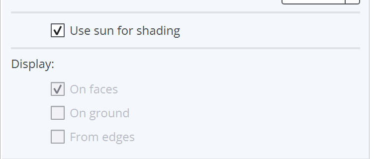
Dynamic height doesn’t work for Entity Info (maybe by design?) but is there hope of getting some mre compaction in the setout? I mean this sort of thing is just wasteful…
I thought, for me anyway, that those simply worked better. I know everyone works differently, granted. The new ones just seem to have a lot of empty, wasted space. Even with my huge screen, 38” 3840x1600, it’s just wasted space.