My input:
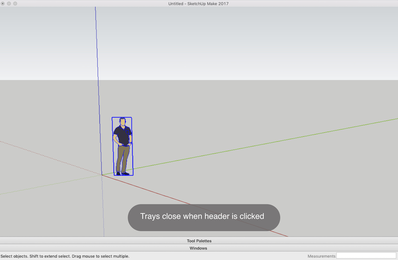
I made a mock-up of a new SketchUp user interface. It has two collapsable trays for tools and windows. The tabs, tools, and windows would be scrollable. The trays would be resizable with a click-drag.
I removed these four buttons because I almost never use them. Also, they’re accessible from the menus.
My main wish is for scene tabs to have drop down boxes so that you can group scenes together (such as all elevations, all sections, all plans, etc).
I also wish there was a bit more consistency and discipline for floating icons and dialog boxes. Some can be auto-stacked, others can’t. Some will dock, others won’t. Some seem to appear automatically on start up by default and you can’t change the default (probably the fault of extension writers, not Trimble).
customizable dropdowns like in the ‘getting started’ toolbar. Available to all OR at least in the API. This could clean up the UI a lot. Just 1 icon in the UI for instance for quadfacetools would be nice if you don’t use it all the time.
A fix for the large toolset would be nice as well. At the moment it doesn’t play nice when adding icons. The UI puts the second icon in a third column wich generates lots of wasted space. See pic
I think one of the good things in the web interface is the attempt to simplify the inspectors by merging related content into the same one (even though I don’t agree on what is related content). For instance Smooth Soften Edges could be moved into Entity Info, where it could replace the Smooth/Soften check boxes as it is really just the same property but controlled by setting a threshold value.
There’s something with the tray that just look better in LayOut than in SketchUp and I can’t put my finger on it (spacing? contrasts?) but unifying the tray visual appearance could also be a thing.
There are a lot of other small tweaks that could be made but in general I think the UI is quite great. It’s very simple and easy to use, just like SketchUp. It follows a lot of conventions so you don’t have to learn the UI, as you have to do on the web, you can just start using it.