Often, when I see certain posts on the forum, I’m really inspired by them. I see things that I wouldn’t have thought of, or just think are useful or cool. I see problems people have, and how people help overcome them. I see new extensions (to me) being used to good effect. I often act on this info and try out new things, just playing really trying things out.
These little things I do just get deleted most of the time, but I thought I’d start to share what I’m getting up to from time to time. Maybe it could persuade others to try a few new things. I do post other things in the gallery from time to time, but I don’t expect anything to be complete works, just experiments in SketchUp. I have started to delve a little into rendering, some posts may include that too.
So to start, a few SketchUp 3d texts experiments, I thought I’d show a few of the (better) ones.
Mmm, I’m as British as they come, but I’ve never noticed the twisted lettering I just scoff the stuff! I’m thinking curve maker to create a helix and then use it as a path for Follow Me…I’ll try anything, once. (within reason!)
I say that because Fredo-twist does seem to have its downfalls with too much rotation, it’s effective to an extent, though.
I kind of got it to work with a test. As expected Fredo-Twist wreaked havoc with the letters. I used the curve maker (helix), and upright extruder method. The result is quite encouraging, I lost the centre of the “a” but I think that can be sorted…(bedtime)
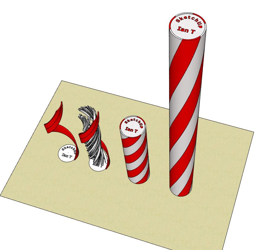
I thought I’d do another one, in true rock style named akin to the place of making and the maker. Same method with Curve Maker (helix) and Upright extrude. I placed the SketchUp letters using the rotate tool, I couldn’t get a good result using shape bender. The pitch of the twist took a bit of trial and error but I think it looks pretty much ok. I did lose the centre of 3 letters, I think that’s down to scaling although I were at 1000x. I don’t think it affects it that much for exercise purposes, though…
Edit-Amended Curve Maker(not draw spiral!)
This image shows both ends of the rock, with some of the letters reading backwards. I sliced one to show the letters running through, which turned out to be a bit of a pain but I got there…
Thanks for the idea and inspiration John, its things like this that made me start this gallery. Maybe completely meaningless chains of thought to some, but can turn into some good practise ideas as far as I’m concerned. As for the rock I’ll think I’ll give it a miss for a while, it’s all I’ve thought about for two days😃
I had an interesting PM conversation with @jimhami42 earlier, showing his interest in the rock idea. He has another way to do it using Spirix which I found really helpful. If he’d like to share how he did it here to show others, he’s very welcome.
I contacted Ian privately because I felt like I was intruding in his Gallery. The Brighton Rock concept is intriguing, to say the least. While there are many tools available, I naturally used Spirix to create a model of the twisted stick:
Yesterday, I made a (mostly boring) video of the basic steps I used:
The completed model is in the Warehouse:
I enjoy seeing the things that @IanT is exploring … I’m sure that there will be more to come
Note how Jim has preserved the internals of the lettering with his method. You might need to scale that piece of rock down a touch, though.(I had a look yesterday) Mine were jumbo size, but I’d expect it to be usually around 300mm long and 30mm dia. for an idea (Although it does vary). Good stuff Jim.
Edit- I don’t know why I didn’t spot it earlier, but me and Jim spoke about “Brighton Rock”. In this post he shows both “Brighton” AND “SketchUp Rock”, he has been busy. They’re both in the warehouse.
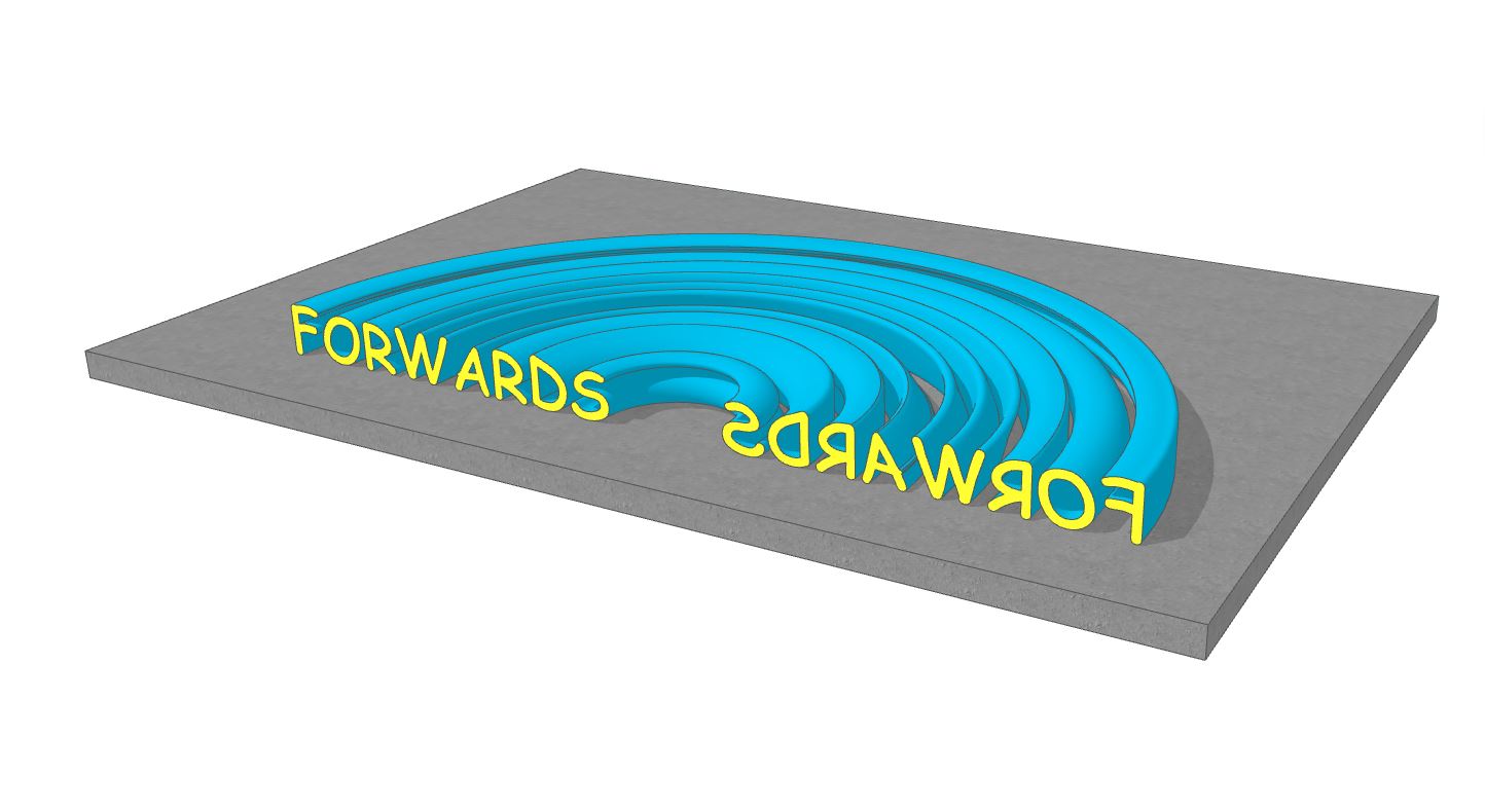
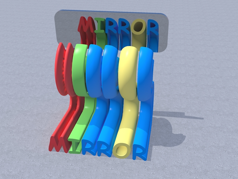
When I drew the SketchUp Rock stick, I noticed how the letters read backwards at one end of the stick. This is how the rock should have been and Is obviously normal, as you are looking at the (back) of the text.
The image below shows this, I used Follow me to show both ends here.
But I thought it would be interesting to somehow show both ends reading correctly. Somehow, I would have to mirror the backward reading end…
So I kind of did just that and effectively mirrored the end. I exported a carefully thought out model to KerkyThea and applied a “chrome perfect reflection” material to the face behind the text, that was also carefully positioned (with some trial and error) behind the text. I pretty much got what I were looking for…


 | British Pathé")


")