it’s like the earth. if you zoom out, it’s a round potato.
but if you zoom in really rally close, let’s say, human scale, it looks flat.
maybe it’s not your tiles that aren’t flat, maybe you’re just supposed to look at them closer
it’s like the earth. if you zoom out, it’s a round potato.
but if you zoom in really rally close, let’s say, human scale, it looks flat.
maybe it’s not your tiles that aren’t flat, maybe you’re just supposed to look at them closer
Like many catastrophes, this one began with me not reading the label on a bag of levelling compound closely enough :^0. I’m pretty good at transitioning pavers on uneven surfaces… but those bathroom tiles can be unforgiving. There is less shadow if I only turn on one light :^).
Even less with none!
Working on some old stuff.
Just a WIP, because now I’ll have to advance it from time to time and show you. Until now this was a Schrödinger’s project, both existing and not
Back in 2013, I did my master thesis (German diploma) in Tallinn, Estonia. Transformation of the prefabricated Soviet districts of Tallinn.
prefab concrete buildings were my jam, I spent 7 month total working on them, not much on the technical aspect, it was already super well documented, but on the social aspect too.
long story short, a few month ago, a former teacher here at home gave my email to a student working on post WW2 prefab housing, so I went and dug everything I could.
At the time, I had modelled several generic units in Archicad, and exported schematic 2d plans. Alas, my Archicad file got corrupted at some point (moving from drive to drive)
And I thought "hey, I don’t have a 3D model hobby right now, what if I redid my file in SU ? and what if I then made a scene from a district I worked on, with a simple clay / monochromatic render? "
(yeah, I need better hobbies.)
So I’m working on the thin one. every panel / slab is a component, that’s the way it was designed, I’m not going deep into constructive stuff, I gave my archive to the univ when I left, they needed it more than I did, just trying to keep it logical.
Right now it’s just elements of a standard floor + additional elements for the ground floor, in front you’ve got an entrance, in the back a mix of 1st and 2+ floor.
Once I’ve got most of it, I’ll assemble a full building on the side, but keep working on this group of panels for ease.
I’m not gonna do the inside, not now, I simply modelled (cubes and cylinders) the kitchen / bath since they were part of a standardised set too. I’ll probably turn them off in the final “rendering” version.
No update on the Plattenbau side, but I managed to remake the paper hexagon thing. Making 3d models is fun, but making them out of paper is also really cool.
One with some cute paper I got on sale JUST before the first lockdown (I was making pointier octagons back then), then fresh from the press, a version using a map. These two were about mastering the concept, what to fold where and how, and making the pattern almost continuous.
But off course, making 3 of these, I’m now thinking about small changes here and there. some of the “almost but not completely flat” faces can become a pain when assembling the final volumes.
Also, a friend (navy captain turned fireman) told me he had access to piles of old naval maps of the area around here. Lots of possibilities popping up.
Ok, finally a quick update, the basic plattenbau structure is basically done, off course, there were thousands of units built, many variation, it’s quite a smart system (I mean, they bought it from the french
), you have the space for a 50m building ? fine. now you have 60m ? add 3-4 panels.
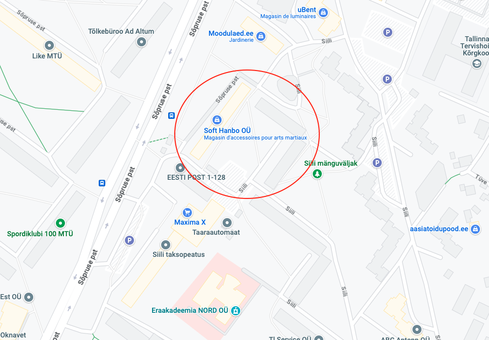
So I picked a small sample of one of the places I studied during my thesis, in Tallinn (Siili neighbourhood), I’ll build a small diorama of sorts, and render a few images.
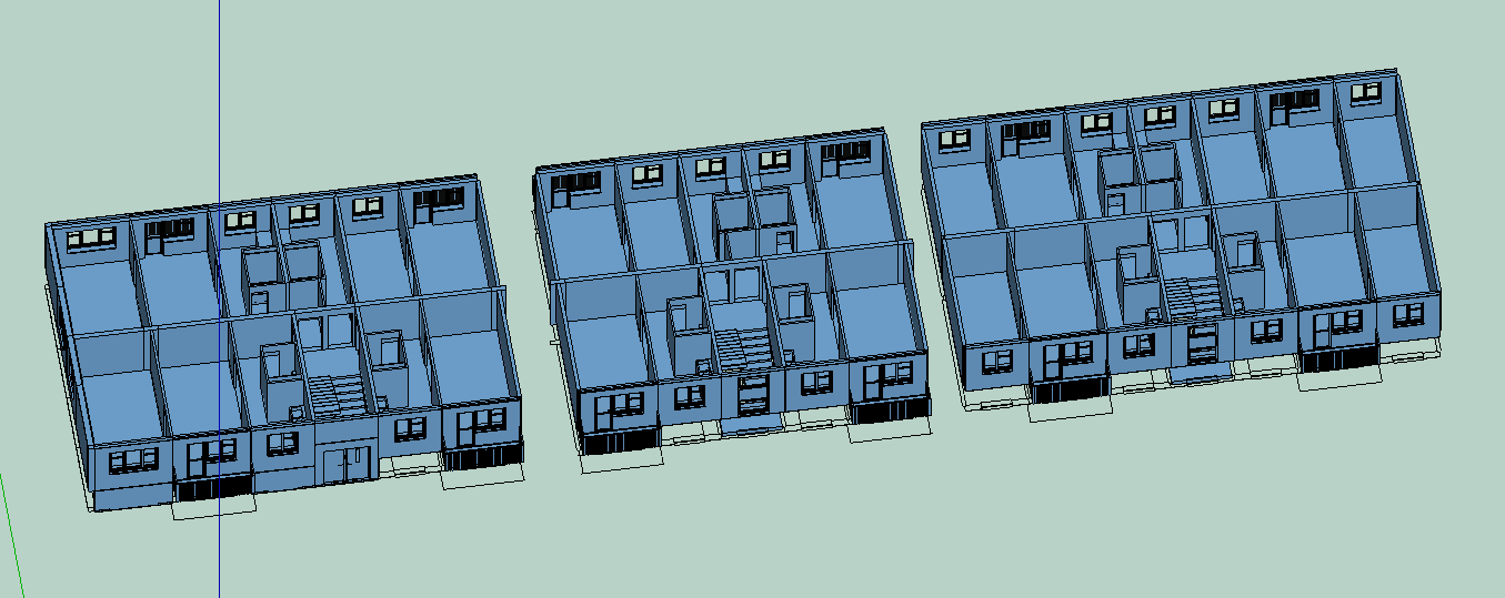
The inner walls are according to ONE specific plan I had, but as I plan to make external views, they don’t matter (only ceilings and walls will be seen)
Fun fact, during my thesis, I worked on the whole neighbourhood, plus the structural aspect, not a specific building. These buildings are not always symmetrical. The two facades can have different rhythms, and in the case of the ones I picked, they do :
B 2 2 B 2 3 2 2 B 2 2 B 2 2 3 2 B 2 2 B
3 2 E 2 B B 2 E 2 B B 2 E 2 B B 2 E 2 3
2
are small panels (2,6m), 3
are wide (3,2m), B
are wide panels with a balcony, E
are entrance / stairs small panels
the structure is quite simple, the two halves are actually quite independent, as long as the panel count ends up the same on both sides
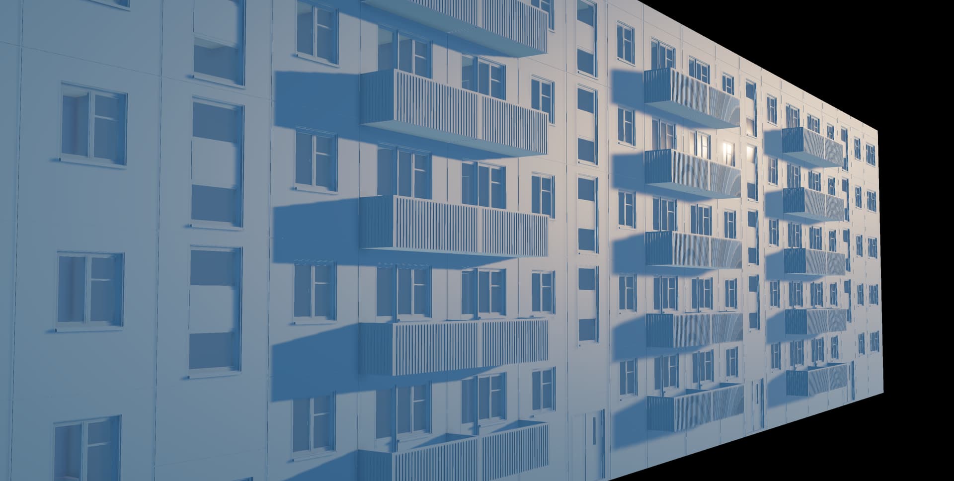
Finally, I spent 10 min tweaking a bit in Trimble Connect Visualizer, my default faces are blue so the model looks blueish. and really, it’s a cool tool, not as deep as vray or twinmotion (I use the latter), But I don’t think I would have made something as quick, as clean on a budget hardware in twinmotion.
WIp of the night.
it’s been a long summer, between cancelled classes, heatwaves, and a general sense of dread, haven’t done much personal stuff.
Last weekend, at a friends wedding, a drunk someone tried to convince me that sketchup was trash, and that I should use Blender (I mean, he does particle effects stuff on video title in blender + after effect, so a real pro modeller. right ?)
So here is the WIP of the night, a middle finger to the haters.
I don’t even like oreos, the brown stuff taste brown, the cream taste fat. I’d rather have a shortbread or a cookie. BUT let’s be honest, they are gorgeous. almost makes me want to try printing one.
Started from the svg on wikipiedia, had to redraw most of it since the svg wasn’t symmetrical.
It’ll probably end up in TCV for a couple of shots. I’ll probably model a small plate too, already have a tea bowl.
while you wait, some more paper stuff I did.
Oh well. no plate. I’ve been absorbed by twitch, and now it’s half past one.
this is sketchup + TCV
tried to fiddle with TCV’s image parameters, gave up, fired up photoshop. When in doubt, photoshop.
Here is a quick preview of what I did :
adjust contrast, add a slight cracked filter on the brown stuff, add a light brown layer to reduce the glossiness.
Great Oreo although I prefer the vanilla ones. Curious of the poly count on one of those bad boys…
I guess they would be easier to see too. Also, I discovered that there is a whole debate about their colour, are they brown or black. it’s a blue dress - white dress debate it seems.
Well the file is a bit too fat I guess, just like an actual oreo
420K lines, 204K faces, mostly due to the high poly circles and curves, combined with roundings.
The components are mostly the decor on top / bottom, since I had to redraw it. make one dot, copy it everywhere, done.
What do you do when anxiety hits at midnight ?
tackle a complex math shape in sketchup off course.
So, Dave did it first here
Off course, he used a follow me, he took the elegant path, a thin line, and pretty much any shape he wants to extrude. Since my inspiration was the lego build (thread above), I went the component route :
2 components. a corner, and an arch.
a bit of tinkering, because until you add the arches, its REALLY ABSTRACT.
Fun thing about the component mode is that at any point, you can cut one corner. and rotate the left ppart on the right to make it twice bigger. and yes, it’s still a mœbius strip of sorts.
So here again, my TCV versions. Simple, mirrored, and then… I took the double and replaced all corners and… well you get the jist. It’s basically becoming a fractal, every step, you cut all corners and extend the shape.
next step ?
well this guy has a lot of mathematically interesting things made out of lego… some inspiration here
Oh, those Lego things are great. These are like Möbius strips, yes?
they are, I wasn’t completely sure, it can be hard to wrap your mind around that, then I softened all the large faces and selected them. it’s a single face wrapped around itself. Cutting it simply makes it more twisty but still, it’s still a single Möbius strip
many of the Möbius lego things are inspired by this artists
cool stuff. trippy stuff.
looking for things to model and hone your skills, instagram is a great place. Watched a guy make fancy ceramic fruit bowls, had to try in 3d.
Off course, hexagon holes, because… hexagon rules !
I guess I need fruits now.
edit : top view is nice too
Nothing new.
stuff I already shown here
but today I had a remote class, a former trainee was curious as what TCV was, from my instagram publications, so I took a couple hours to show and try on various models.
I ended up adding quick and dirty wood materials to these old models.
the “automated bump map on wood” is really unpredictable. some materials will appear flat when put on an horizontal face, but as soon as they are on a vertical one, or applied to a whole group at once, BOOM weird automated bum. I ended up removing any wood material from the blue nightstand because of that, it was too random.
I guess with TCV I’ll stick with the colours more than materials. It’s still compatible with Vray or Twinmotion, use colours in SU, and use proper materials in your render.
Oh and I grabbed a mannequin from the warehouse, ended up remodelling some of his body parts. he’s just here for scale. he’ll need a name.
Shadows are a bit meh. their softness is not super great. but heh, free tool, 2 min rendering (4 with the photoshop cut and adjust)
What was your process for the fruit bowls?
unprocessed fruits…
lot of touch and go. I erased some of the earlier tries, but here :
I started by making the bowl with a follow me, and from that I extracted 2 pieces : the middle, and one slice. my idea was to flatten the top face of the slice, trace the holes on it, re-curve it back (just rotate) and pushpull the holes away.
it worked, but since I made it by hand, trying to work with the existing folding lines, it didn’t look good.
here you can see the early early stage, the top face flattened, with the fold lines visible, and me trying to decide where to place and scale the diamonds, trying to avoid the fold lines. You see, teh closer to the bottom you are, the smaller they should be, and the closer to each other, to keep a constant distance between each other.
So after a couple of tries, I just say “ahh, duck it”, and restarted fresh, using shape bender. no more worrying about the fold lines, just treat it as a long stripe, and clean the results at the end.
I placed the top and bottom rows of hex as I wanted, drew a grid from that, then duplicated them, and eyeballed the scale and position (I did half then mirrored). same for the half-hexes on the sides. what mattered is that it looked the way I wanted. then using shape bender and the original slice, curved it back.
a direct joint push-pull approach didn’t quite get me the results I needed, we’re talking about several faces in several directions. so instead of getting rid of the holes and pushing the material, I got rid of the material and pushed the holes into solid volumes. Then, solid tools between the holes and the original slice.
in the end, I scaled it up a bit, the end plate was a bit too flat.
But from there, it’s only a matter of placing one slice on the core, then rotation+copy.
so the Tl;Dr - made a follow me plate, kept the core and one slice as component, extract the top face of the slice, work on it, curve it back in shape, use that to poke holes into the original slice, then array the component around the core.
Long time no see, busy autumn, lots of classes in various places.
Let’s talk aperiodic monotile paving of the plan shall we ? And the Einstein problem ?
I expect you’re all already quite educated on this but for the two slacking in the back, a crash course :
Paving a plan is basically tiling a flat surface, like you would do in your living room.
a paving can be periodical. Think square tiles. or rectangular ones. or maybe herringbone wooden floor. or hexagonal provencal tomettes.
periodical roughly means that if you take one part of the paving, and you either translate or/and rotate it, you find the same somewhere else. It’s pretty intuitive, if you use square tiles, and you move a few metres away, it’s still the same pattern.
aperiodical means the opposite. it means that when translating and/or rotating, you will NEVER find exactly the same pattern.
Basically, an aperiodical tiling only has ONE infinite pattern, and you pick different places in it.
There are many aperiodical tiling patterns, using several tiles. Some are purely mathematical (and quite ugly), some are really pretty, the ones from Roger Penrose for example.
He created a pattern using 5 separate shapes, but his most famous is the second one, only two shapes, kites and darts, and a variant with rhombus.
https://upload.wikimedia.org/wikipedia/commons/9/9f/Step7wPaper600DPI.png
For a long time, the minimum tiles needed to make an aperiodical pattern was 2.
At some point, a mathematician devised one monotile but with holes in it (the tile was not continuous… mathematicians were like “ah come on man, you’re cheating”
This spring, a Monotile pattern was presented to the public. it uses one tile, ein stein in german (yes, it’s a german math joke) with at times, symmetry.
The tile is called Hat or shirt, depending if it’s normal or reversed. Here the red are reversed.
later, they explored all the variations of this tile and found ONE specific pattern that is actually an einstein pattern. they call it the spectre.
https://upload.wikimedia.org/wikipedia/commons/a/aa/Aperiodic_monotile_tiling.png
For mathematicians studying topology and paving, 2023 was hot. it’s like… being a painter and discovering a new yellow that nobody ever saw before. it would be wild.
Since the hats and shirts were announced, they’ve been in the back of my mind, scratching. They are simply Four thirds of hexagons. nothing actually too complex.
A few weeks ago, I stumbled on a video from a mathematician mentioning that the MoMATH in NY was holding a Einstein’s Hat competition.
Free competition, could be baking, sewing, art, whatever, on the theme of the hats and shirts.
Got the info on a Wednesday night, deadline was friday morning 6 am (in france). So it was a bit of a rush job.
Waiting for the results now.
In gold are the reversed tiles, black and gold are the first and second layers of adjacent tiles.
Here is the one on instagram. same thing, different place.
Design was made in Sketchup. after all, all you need is Three hexagons as a base.
I has a modular design first, building 1/3 of hexagons and assembling them 4 by 4.
But the deadline was here. so I went a more classical path.
Quick mockup with components to adjust the proportions (height compared to the hat shape)
Then cut the shape in two, flatten it, and add tabs.
I know, some faces are painted, some reversed, I couldn’t care less. It’s going out as a dxf anyways.
Assembling the tiles was quite simple, painting them too (easiest part), mounting them on the canvas was not. they turned out super flat, and since paper is flexible, it was way too easy to mess up their geometry while gluing. Thankfully, black on black, you don’t really see the places where I messed up.
So yeah, same process as the other ones, with with a theme and a short deadline. happy of how it turned out, I won’t do any variation anytime soon though.
Right now I rolled back to normal hexagons. sort of.
do you have any idea how complex and time consuming it is to plan a diagonal gradient between two similar colours using truncated octogonal pyramids ?
it is. solid 4-5h 3d / 2d preparation, 5h for a first blue-yellow test, 22h30 for the big one.
Conception was a back and forth between my sketchbook, sketchup (to know how many hex fits in the frame I had), photoshop for a low rez gradient, then SU to translate that in not-so-random colour scheme, then some time counting and separating the 14 different variants (28 if you consider that there are two colours), then a bit of unfolding, some very complex layout in illustrator, a few cutting failures, a few series.
And you know what ? looking at it now, I wonder if a three colour scheme would have been better, yellow to tangerine to orange.
that’s more work for “2024 me”.
right now “2023 me” has 16 days of SU training in the next 18 business days. the usual “end of year-hurry let’s use our training budget before it’s wasted” time of the year.