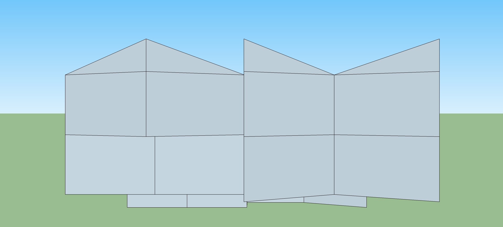
A lake cabin I call A-frame Cubed:
Front-Right View:
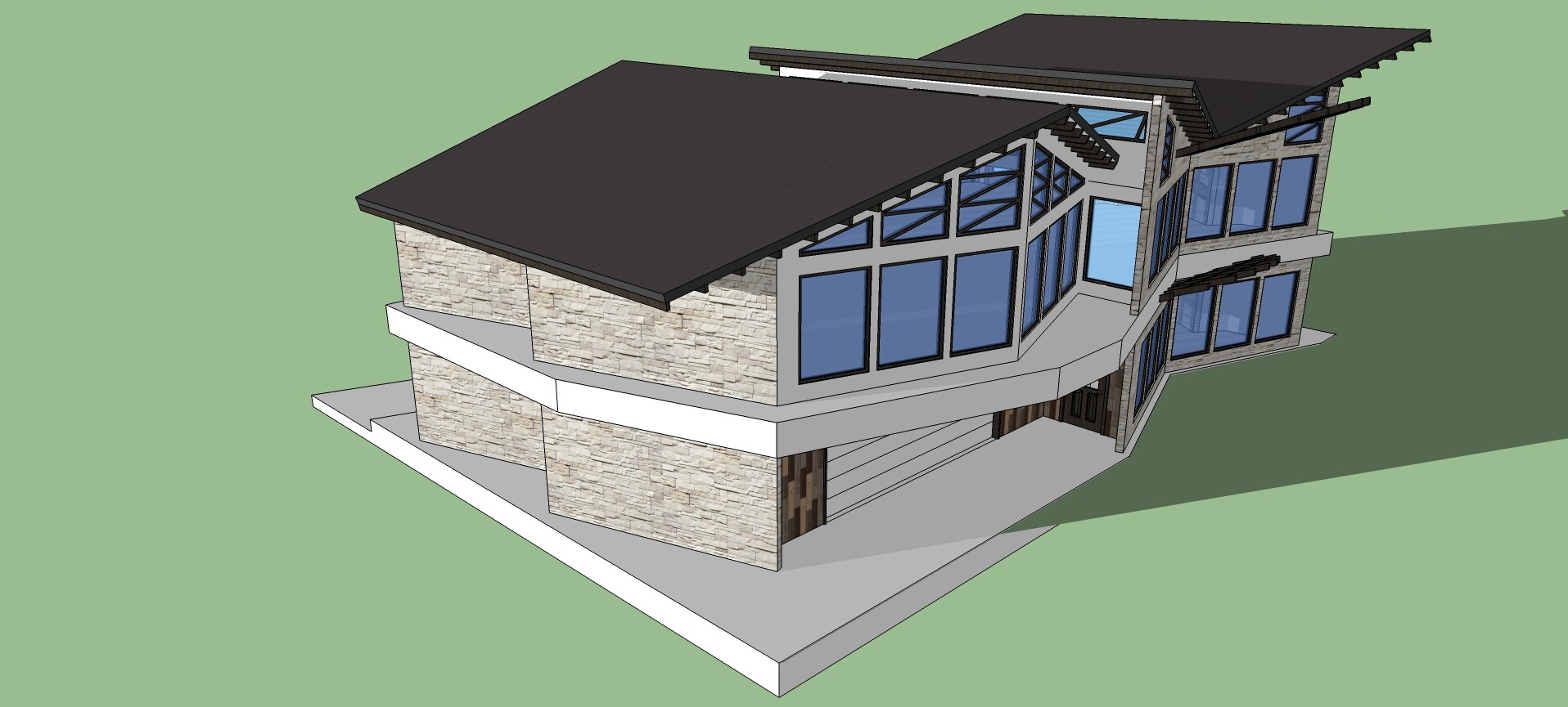
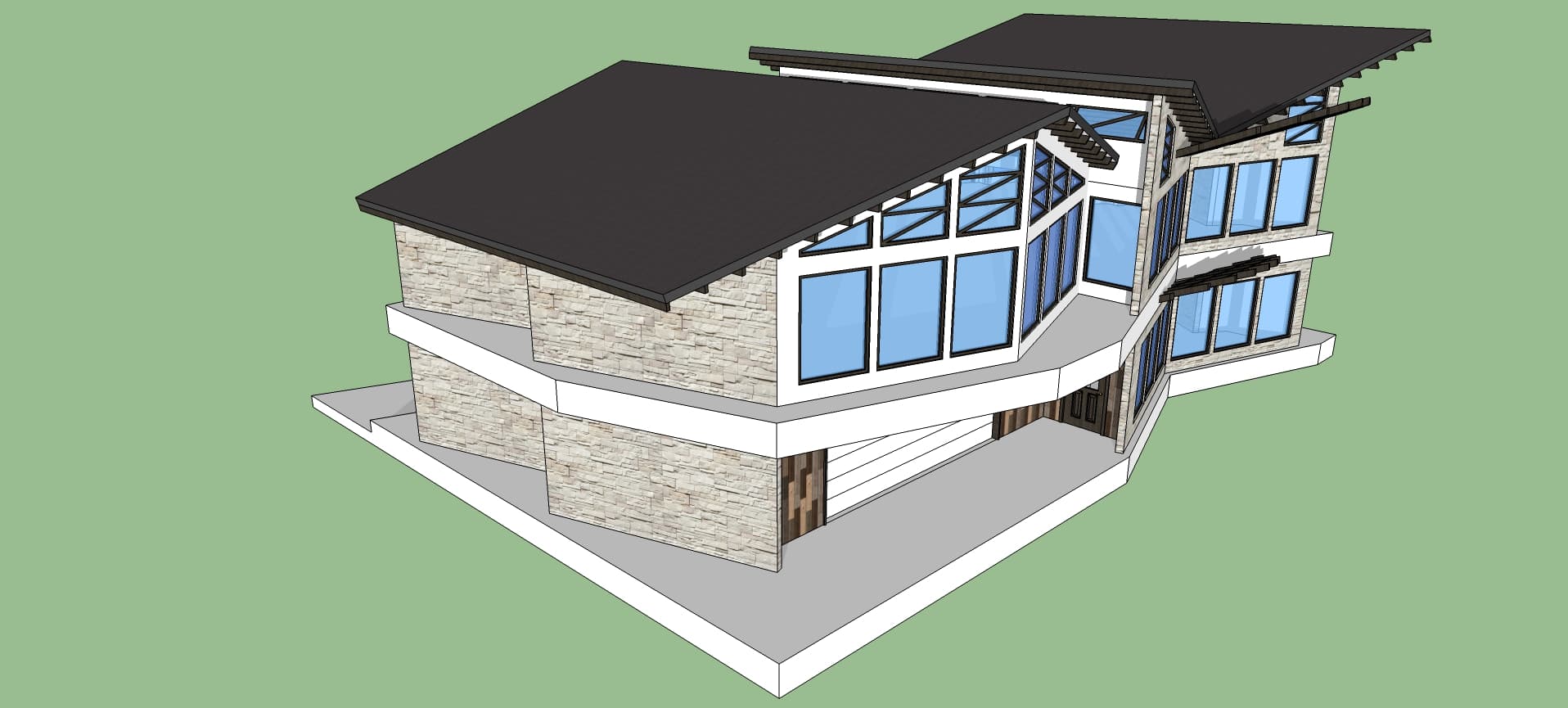
Back-Left Isometric:

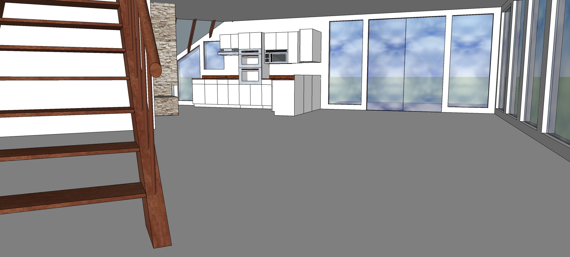
1st Floor, looking toward the kitchen:
A lake cabin I call A-frame Cubed:
Front-Right View:
Back-Left Isometric:
1st Floor, looking toward the kitchen:
Here is an apartment complex design I put together recently…
Front-Left Isometric Sketch:
Back-Left Isometric:
Right Side:
Top View (showing upper patios and skylights over lift shaft and stairwell):
Front-Right Elevation Detail:
Here is a church concept I just finished…
Front Sketch:
Front-Right Isometric (showing glass elevator):
Sanctuary / Auditorium (with seating for ~7,000!):
Prayer Chapel and Meditation Grotto (with fountain):
Church Offices (including meeting rooms and storage space):
I had originally intended for this to be a mid-size church (for ~500 people), but had no idea how much space to allow for the auditorium until I had put the seats in and saw how many people it could accommodate! I guess some things you learn by trying… fortunately, we can try it virtually with SketchUp without wasting anyone’s money!
Also, placing that much seating, with varying row lengths and the uphill angle, was quite tedious! Has someone made an extension for this?
Here, again, I encountered difficulties with SketchUp Make. After most of the geometry was in place, the tape-measure tool began to act strangely. If I clicked on a horizontal line, it would try to draw a vertical, and vice-versa. I had to save, exit and re-open, which helped for a while, but it did happen again once or twice.
Here’s a concept I created in February, but didn’t add the finishing touches until this past weekend. It was inspired by the Aqua at Lakeshore East in Chicago…
Left Side View:
Front View:
Right View:
Back View:
Front-Right Isometric:
Detail from Below:
In the above model, I intended for the green panels of the balcony railing to be tinted glass. However, there is a bug in SketchUp make that shows up when a transparent material is in the background of another transparent material:
So, in the model shown above, I had to adjust the “transparent” material to be 100% opaque. : (
I see that effect with some materials. I wonder if this is related to them being based on bitmap images. I find this effect on the right hand material in this movie. If I change to a style (or edit the style) for “Nicer” transparency, it seems…nicer.
Thanks for the pointer, @pbacot - I wasn’t aware of that setting.
Unfortunately, I find it’s not so simple…
To test your suggestion, I changed 1 panel to the dark green glass. It actually looked pretty good this time! But when I flipped the setting from ‘faster’ to ‘nicer’, it looked more like the image I posted, above! (I.e. worse, not better… go figure.)
Even if I got this to work, it would be painful to go back over all the green panels and change them one by one. I previously had painted them all with dark green glass, but when it didn’t look good, I edited the ‘In Model’ version of the glass to be 100% opaque. I thought I could just change it back to 50% again, but no… Somehow, SU has changed all those panels so they only have the material applied to the front, not to the reverse side! (Normally, when you paint with a transparent material, it paints to both front & reverse.) So, yeah - I would need to repaint every green panel, and I don’t have the heart to go back over all that now.
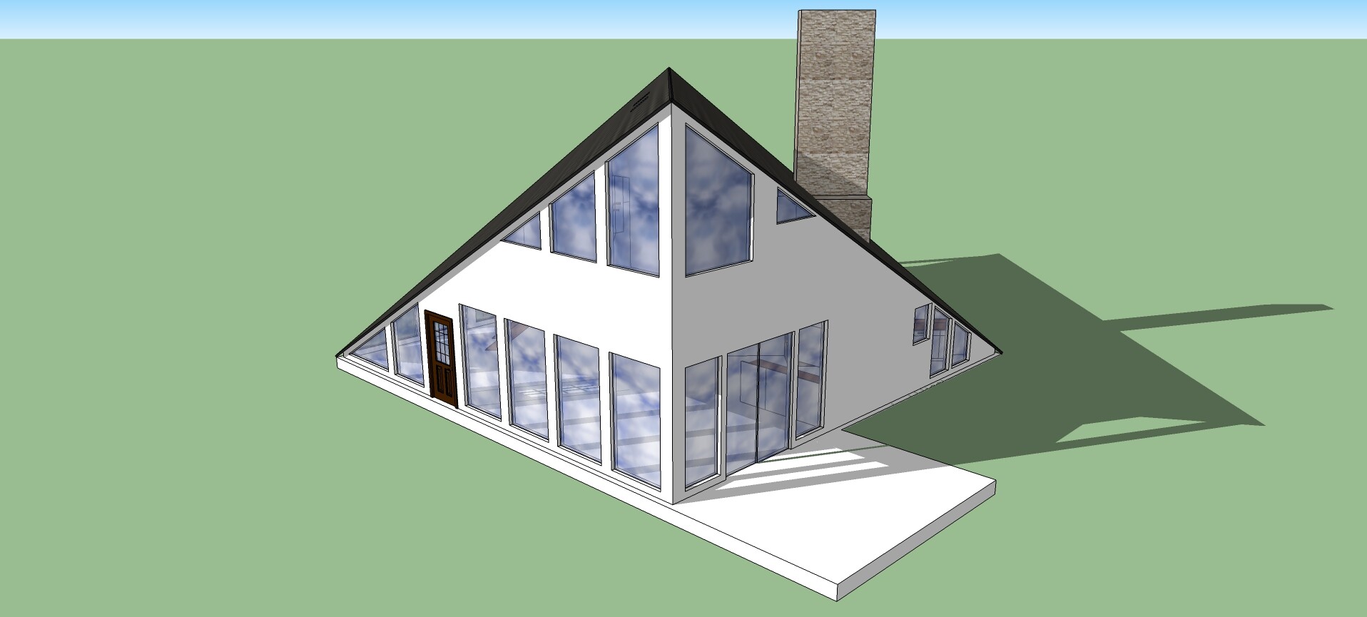
Another variation on the Wedge House (I like this one the best):
Wedges Rough Layout - Front View:
Model Front View:
Back-Right Isometric:
Back Left View:
Top View:
This time, the modeling went much more smoothly; it was much less painful than before. The difference is that I modeled 1 exterior wall with all sides rectangular - no odd angles. Then I copied that wall many times and placed it around the model where it was needed, with overlapping corners and all. I used scaling to account for the differences in sizes. Then, when all geometry was in place, I made each wall unique and chopped off corners that were sticking out, cut windows and doors, etc.
The moral of the story: Always draw and place geometry with rectangular faces! (Change them at the end, if necessary.)
I forgot to mention earlier that I took a fairly close look at sunlight angles prior to designing this house. For this, I used https://www.suncalc.org/ to calculate the solar data for my location.
SU17 Make allows us to display shadows on our models, according to time zone. It’s pretty easy to use, but sacrifices accuracy, since it doesn’t take into account which side of the time zone the model is on. More importantly, it does not consider latitude.
Here are SU images of shadows on my latest Wedge House (Front Left Isometric), at various times:
Summer Solstice (21 June), sunrise:
Summer Solstice (21 June), noon:
Summer Solstice (21 June), sunset:
Winter Solstice (21 June), sunrise:
Winter Solstice (21 June), noon:
Winter Solstice (21 June), sunset:
SU believes that the sun rises at 7:25am on the winter solstice, and it officially rises at 7:48am. SU also believes that the sun sets on this day at 4:34, which is perfectly accurate.
Meanwhile, SU believes that the sun rises at 4:38am on the summer solstice, whereas it officially rises at 5:26am. SU also believes that the sun sets on this day at 7:29pm, whereas it officially sets at 9:05!
Something to be aware of when using shadows in your SU model - it can give you some idea, but it’s not precise.
Here in central Minnesota, sun angle various considerably throughout the year. In the winter, the sun rises in the southeast and sets in the southwest, as expected, but in the summer, it actually rises in the northeast and sets in the northwest! So, given how cold it gets here in the winter, it’s important to consider ways of maximizing solar gain at those times, while minimizing it during the summer. (Fortunately, we get a fair amount of sunlight during the day even in winter.)
The front of this house faces south. The upper and lower pergola on the front side are angled to allow as much sunlight as possible on the winter solstice, while progressively mitigating sunlight and solar gain toward the summer solstice.
Is your model correctly geolocated?
Another thing about times in summer: The Shadow dialog uses Standard time, it doesn’t support DST.
No - Geolocation was broken by Trimble for SU17 Make…
You can still input the correct values “manually” (look them up in Maps, for instance). Otherwise the model will be in Colorado.
Go to Window/Model Info/Geo-location, then click on the Set Manual Location… button.
Thanks, @colin, I was able to enter the coordinates. However, now SU believes that the sun rises at 4:05am on the summer solstice, whereas it officially rises at 5:26am. SU also believes that the sun sets on this day at 7:29pm, whereas it officially sets at 9:05.
This is a bit further off than previously…!
Also, suncalc.org gives the shadow for a 3m object at noon to be 1.5m on the Summer Solstice and 7.64m on the Winter Solstice. SU shows it to be about the same on the Winter Solstice, but 13" (0.33m) shorter on the Summer Solstice.
Could this be due to a problem in entering the longitude? Suncalc.org shows my longitude as -93.441940W, but after I enter that in SU and click OK, it gets changed to 93.441940E… (That doesn’t sound right to me, if these things are measured from Greenwich, UK, but what do I know…) Google, by comparison, shows my longitude as 93.441940W (not negative). So, I’m really confused about what to enter into SU to get a correct result.
Best option would be to go to maps.google.com, right-click where you live, and choose the first menu item. That will put the coordinates onto your clipboard, in a format that SketchUp seems to like. Paste what you have into the Latitude field, then cut and paste the second number into the Longitude field.
Here is another model, this time inspired by FLW’s “Usonian” designs. I call this Wisconsin Lake House…
Here, again, I looked at shadows. The image above is for noon on September 21. Below is a look at the front-right (SE) corner with sunlight angles for December 21:
Back-Right View:
As with many FLW designs, the monumental chimney is toward the center of the mass. The light well over the kitchen is also taken from one of his houses. I added a light feature in the shared wall between the kitchen well and the upstairs bathroom:
View of fireplace in Living/Dining room:
The fireplace here is shared with the den behind the porous brick screen.
View of the cozy Master Bedroom, with its own fireplace and FLW-inspired clerestory windows:
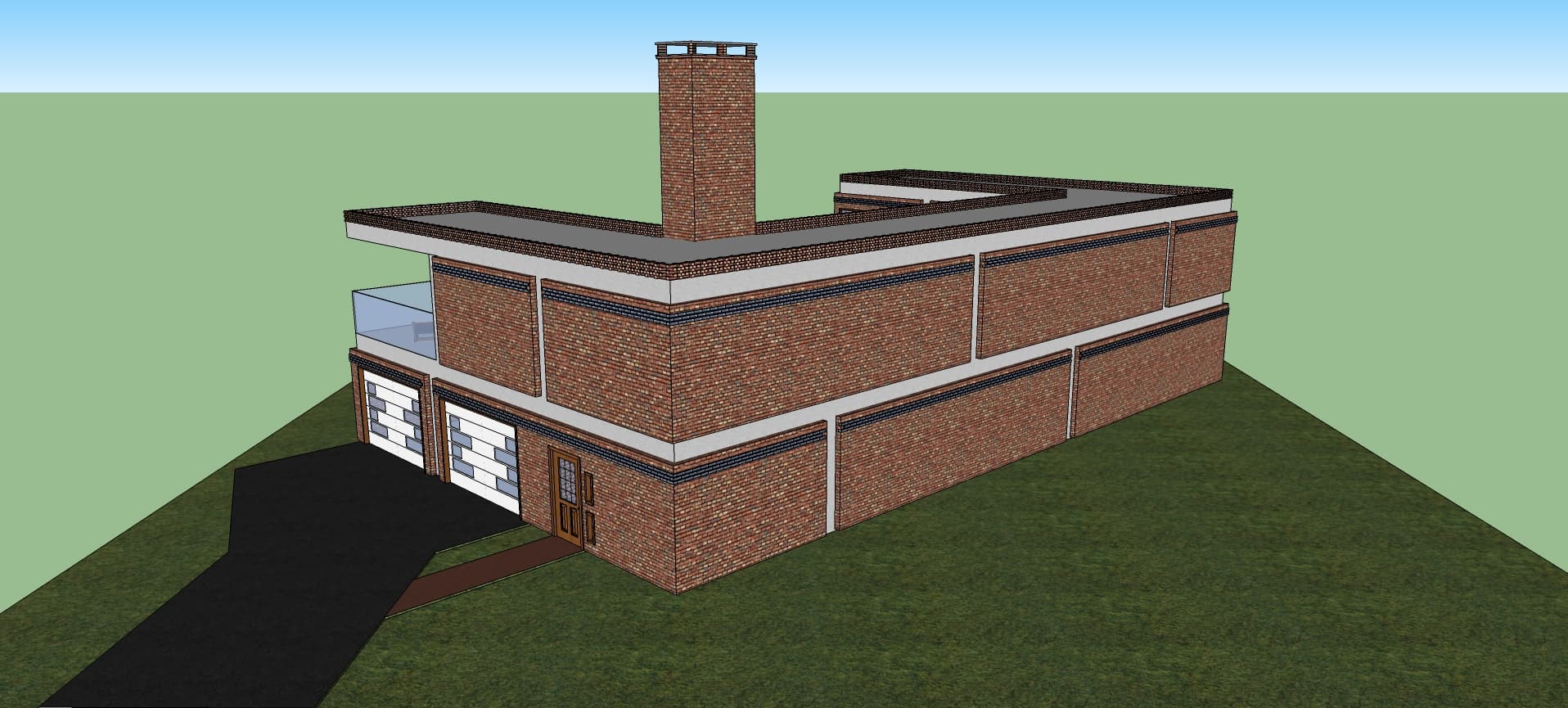
I finally decided to build a brick house… ![]()
Frank Lloyd Wright typically used a particular shape as the organizing principle of each design, and that shape would be repeated in various ways throughout the design. (He also often used designs from Navaho textiles in his windows and furniture.) For this house, I used an object as my organizing principle: the standard-sized brick!
The face of the structure is made to look like huge bricks, while being made from standard bricks. The “mortar” here is simply concrete. The part of the chimney which is visible over the roof also has the proportions of a brick standing on end…
The vertically-oriented windows are also proportioned (roughly) the same as a standard brick. By the way, did you know that each end of a standard brick approximates the “golden rectangle”?
Within the main entry of the house, to the left of the door are two narrow brick-proportioned windows.
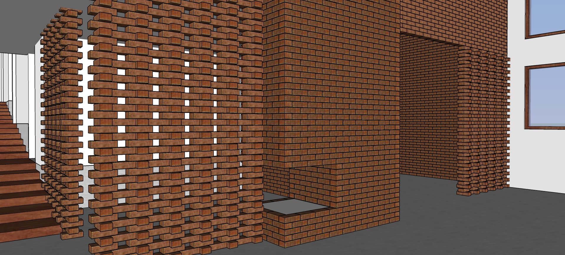
To the right of the door there is a coat closet formed of bricks, left with gaps to form a “porous” wall. (Ventilation helps wet coats to dry off.) The sliding metal doors on this closet are perforated with brick shapes. Guests are warmly welcomed in by the fireplace (though this one is still waiting for its gas fireplace insert).
Turning around we can see past the living room toward the dining room and kitchen (with a half-bath on the right):
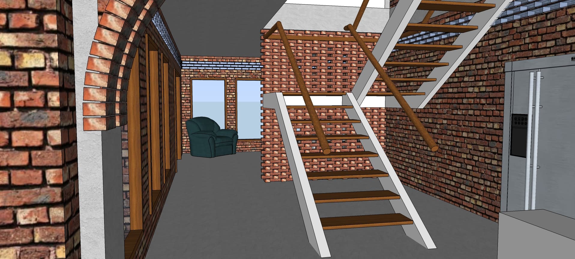
Around the corner from the kitchen, we find the back stairs with a 4-season (or “all-weather”) porch beyond:
A brick dividing wall separates the stairway traffic from the quiet porch. Here’s a better look:
Up the stairs, we come to the home office:
The second level of the house holds the bedrooms, with the master bedroom on the far wing of the house:
Another fireplace keeps the master bedroom cozy. Just outside the door, on another face of the chimney is another fireplace for the upstairs hall.
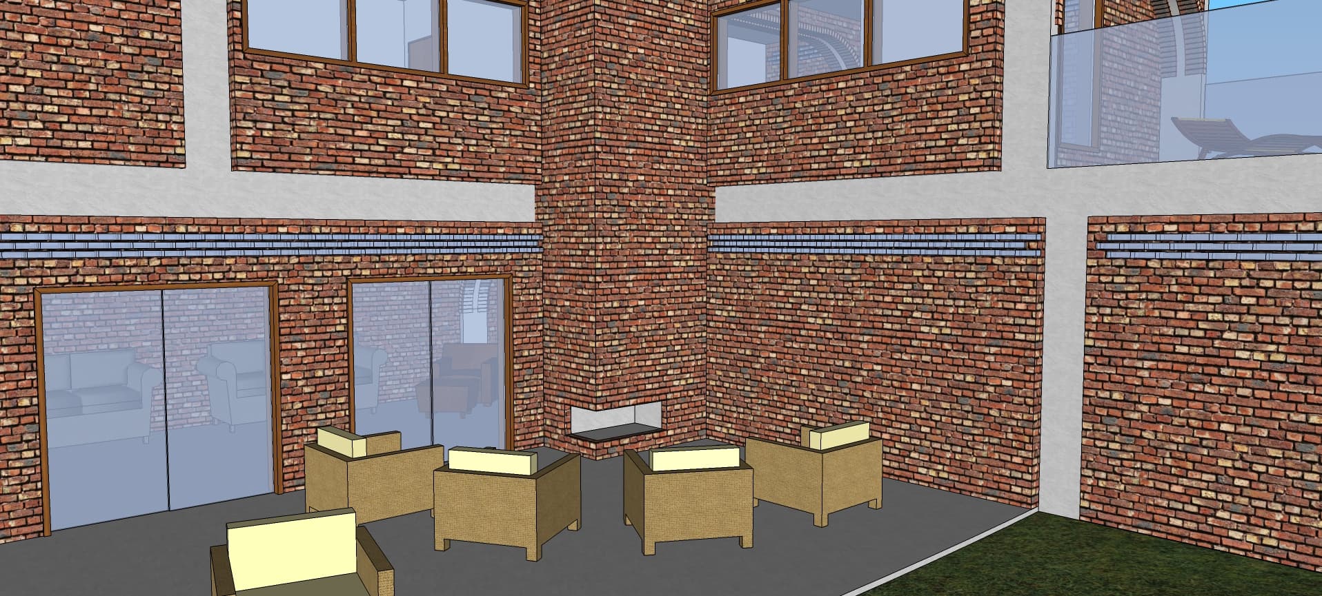
The back side of the house embraces a patio for entertaining:
An outdoor fireplace supports gatherings on cool evenings.
The edge of the roof is fringed with a short brick wall for safety, as well as aesthetics:
Small gaps allow this wall to be somewhat porous as well.
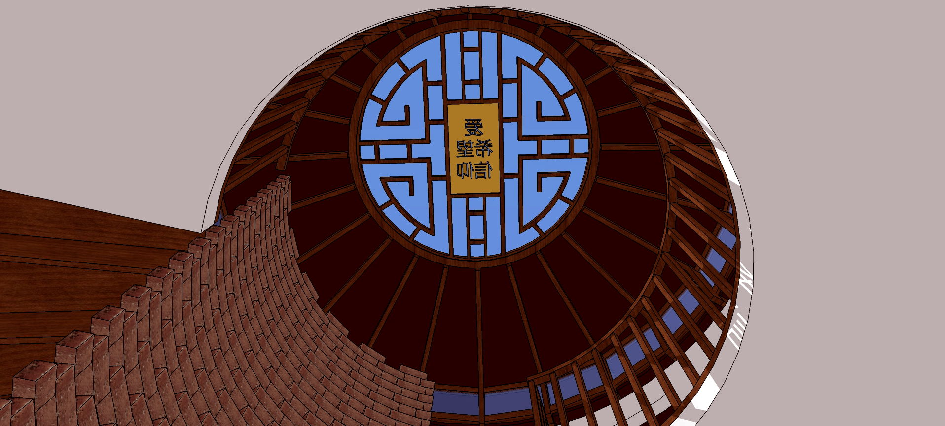
This model is based on the geometric primitive of a circle…
After I got into it, I had a sudden inspiration to draw on Chinese culture, as you can see in the skylight, above. Here’s a view from the front:
Around to the right, there is a patio with a pergola which surrounds a tree, providing a semi-shaded space for entertaining:
And a view from the left side shows the carport:
Here you can see that the structure is complemented by decorative brick work. Also, clerestory windows are visible at the top of the house. These, along with the skylight, bring light into the central atrium of the house:
The center of the skylight contains Chinese characters, and the light through these can be seen on the right side of the image, spilling over the edge of the second floor. Another porous brick screen in the interior hides the stairs between levels.

Looking downward, we can see the sunlight filtered through the skylight, shining on the atrium floor outside the kitchen, with the stairs just beyond. Here a brick fireplace can also be seen. Brick is also used for the kitchen flooring.
The use of earthen brick, along with ash wood trim and dark green carpet, brings a feeling of the natural world into the interior of the home.