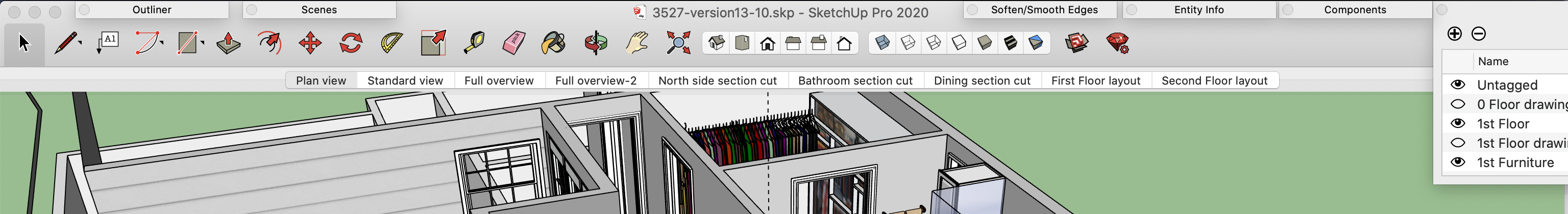
I like keeping my tags tray open, but it takes up so much real estate! I don’t need to see all those columns and it seems crazy that I can’t reduce them or turn off the color and dashes columns. I could easily do with with half the current tray width without changing font size–look at the wasted space in the tag tray below that I never use. All I need is the eyeball and a variable width name column.
To make matters worse, after I’ve manually minimized the tags tray width as much as possible, opening another try causes it to get wider and it doesn’t revert after closing the other tray. In fact, if I minimize all the trays then reopen the tag tray, it comes back at the wider width.
Although, I’m working on a 16" MacBook Pro and one might argue that I’m expecting too much on a laptop, I’d counter that real estate is always valuable no matter how much you have, and having some control over the width seems pretty basic. At the minimum the tray width should revert back to the smaller size once other trays are closed.
Other than clicking on the lower left corner of a tray to adjust the width I don’t have a clear answer for you. You might need to move them a little away from the edge of the screen to grab the corner. Feel your pain , I think tray behavior has been weird on a Mac for years and it’s never really been addressed by SketchUp. I can’t for the life of me change the height of the entity info tray it and has been that way forever,
The width of the snapped together panels is as wide as the widest one, which may well be Tags. Entity Info is only a little bit narrower.
A low-tech solution is to separate Tags from the other palettes, then you can position it with everything except the eyeball and start of the name being off screen.
This is the narrowest Tags ever gets–even if alone. When stacked with other trays, most open wider than Tags–and the stack remains set to the wider width even after closing and reopening Tags only.
I get it–this may be viable if I can figure out where to stack the other trays. I noticed that if I close the Tags and reopen, it snaps back to being fully on screen. But I’m going to play with this because I only need the eyeball and about 5 characters of the Tag name. Maybe I need to rethink my whole screen layout and toolbar. Thanks for the tip!
I wish I could put trays in the gray bar at the bottom and have them expand “up”. There’s a lot of wasted space down there that I don’t look at much except for the info box in the lower right corner. Or maybe a one row horizontal tool palette down there. A vertical one that’s single column and customizable would also help. I’ve read some of the threads related to this topic-- I hope SU gives Mac users some additional options for managing our work space in future updates!
I unlinked my tray stack and spread them out across the top of the screen. It’s only been a few hours, but liking it so far. Thanks, Colin, for the simple suggestion to just let the Tags tray run off the screen. Once it was detached it motivated me to think about new places for the other trays.