To help celebrate the launch of SketchUp for iPad, we’re giving SketchUp for Web a facelift today. (And make sure to read till the end if you’re already a Shop subscriber!)
A new set of icons and cursors
Color, contrast and consistency are key to being able to quickly recognize and select specific tools, so we’re excited to introduce our newest set of icons and cursors in SketchUp for Web. These icons embrace SketchUp’s history while bringing a renewed set of design principles that reflect the SketchUp brand’s unique blend of fun, irreverent professionalism.
PS – don’t forget to say hi to Miles, our new icon for Search. He’s really good at fetching things.
Purge unused items
If you’ve been iterating on a model for awhile, you probably have accumulated some “clutter.” The new “purge unused items” dialog will prompt you at key points across your journey – like exiting your model or initiating a manual saving – to purge your model of unused components, materials, tags and styles.
Purge all can reduce your model’s file size and make it more performant. Note, you can tweak how often you see this in App Settings – including turning it on to always clean up your model or to never initiate.
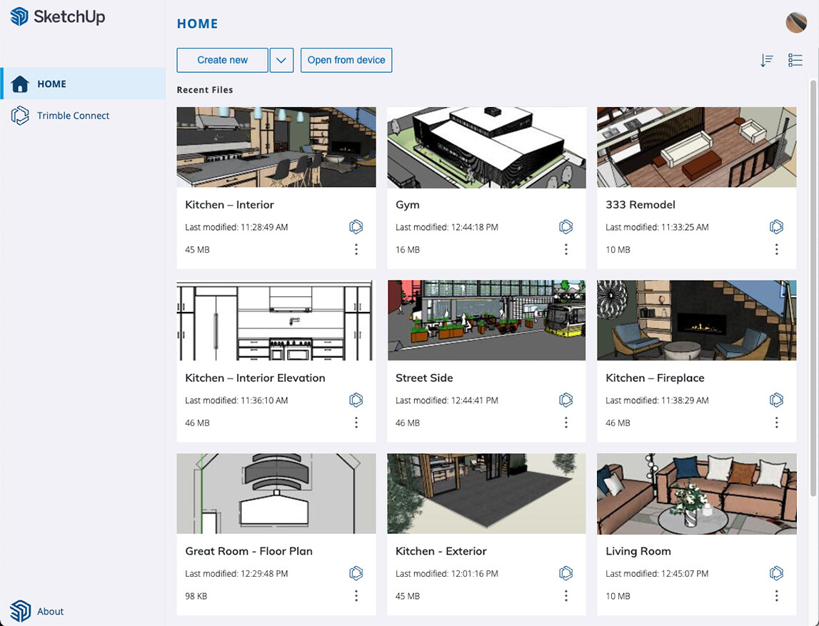
Persistent thumbnails
Thumbnails are a great way to visually scan your projects and quickly identify your files. Thumbnails on the Home tab of SketchUp will now persist across sessions, browsers and devices. Please note, you will have to save existing files once for this change to take effect.
Introducing SketchUp Go
Last, if you’re a SketchUp Shop subscriber, you may notice we’ve rebranded this offering to SketchUp Go. SketchUp Go has the same products as SketchUp Shop and now includes SketchUp for iPad – for the same price! If you’re already a subscriber with an iPad, head on over to the Apple App store to download your copy of SketchUp for iPad. If you’re not already a subscriber, try it free for 7 days.
I warmly welcome your efforts to make the user interface more colorful. Personally, I like colors much more than “all shades of gray”.
No, no, I’m not a UX developer, but I would like to share my personal opinion, hoping this can improve the changes in some way.
Contrast:
First thing I realized, the contrast of the new icons is somehow not enough for my old eyes. Actually the icons - at the real web UI - looks like as the left picture below (grey-ish background). However the way it is posted above it is much better (white background). I just copied it to below for comparasion.
The “red”:
For me, red is more of a warning or a mistake. Maybe some other color would be better than red.
The “goat”:
Indeed. At first I thought it was a goat. (What the h… does a goat do here?)
I had to zoom in on the picture to discover that it was more of a dog running after frisbee. It’s basically a good idea, - (if you finally understand the “joke”) - but somehow it doesn’t fit here well.
(BTW. : I wonder why Miles can’t find anything about e.g.: “purge” ? Why is there no INSTRUCTOR on the “dog” search? )
Are you out of “toner”?
There is only one red dot on the right side of the screen (on the “instructor” hat ) but otherwise using different colors than the left side. You just “running out of paint”, or these are not “icons” but menus? Does some changes will come there too?
Explore Help Center ? >>
The help pages explaining things based on the old user interface. "I sense a disturbance in the Force."
I’m finding the eraser tool in particular is much bigger and less accurate. It’s not clear where the tool point is precisely. Previously, it was an obvious circle. Now it’s a line. Some refinement needed still imo.
I second the eraser icons clumsiness, playing with it yesterday I had a hard time telling where the tool actuates from. It’s a basic need of a curser that I can put it exactly where I want to and do what I want on the screen. The Pro eraser still has a nice clean tiny circle to tell us “erase things right here”, really hope that does not change.
Thanks for the thoughtful feedback, dezmo. While we started with the icons, we do have plans to look at the UI as a whole and work on color and contrast on the panels as well. Hopefully, as we continue to make improvements across the UI there’ll be a consistency of contrast across the board. Once that work is done, we’ll be able to update screenshots in places like the help center.
Yes, the ‘goat’ (greatest of all time?) is a bit different, but we wanted to distinguish it from the usual magnifying glass used for search as that is often confused with the zoom tool. We wanted also wanted to bring a little whimsey and playfulness back to the UI!
Good feedback here. We will look into making some improvements here to make it more obvious where the eraser point is exactly. Thanks for flagging. Stay tuned.
Some of the whimsey of the past has led to frustration and complaints of unprofessionalism.
Jokey error messages and sprinkling the magic, rather than informative error messages and clear information can severely frustrate users. It is has also been a weapon often used to bash sketchup as nothing more than a children’s toy and not a professional tool.
I looked at The Goat and couldn’t for the life of me work out what it was, I guessed what it did from it’s position on the toolbar, but without prior knowledge it was just an indecipherable blob. I thought maybe it was a rabbit, fast way to find a tool, but then the tail was wrong. As Endless says, I certainly wouldn’t be surprised to see a whole team and sleigh following it up.
I also read something about Miles somewhere and had no idea what that was, until I managed to put the two together. It harks back to that annoying paperclip that everyone hated and never used.
I’m very glad you have brought colour back to the icons, I would prefer to see more as I tend to see them as coloured blobs rather than delicate designs. Tools take on an instantly recognizable graphic image to the mind, whether on screen or around the studio. The mind sees a shape and colour very quickly and knows what it is without actually identifying it in brain words. You shouldn’t have to look specifically at each tool on a bench until your mind says that one is the hammer. The same with all the pop out menus, I feel like I have to open someone else’s draws looking for the right tool because they don’t sort them the way I do. Sure on phone screens and small devices it can be useful to have pop outs, but on a full screen with more than enough space for all of them to be visible it is just an annoyance to many people. How about giving us a choice to lay them out or tuck them away.
Please be very careful with your whimsey and test it out first on people that have no prior knowledge to see if it makes any sense without the joke.
This shape of dog that is difficult to recognize, even more confusing. I would immediately exchange it to the widely used search icon (with more eloquent tooltip). Even so, if one (some) of the developers is bound by gentle emotions to her/his dog named Miles. You can not assume about most of the user they will recognize this emotion. Specially it you do not heve a willingness to update the documentation until everting is final.
The tool that icon is representing the most powerful (“greatest of all time?”) part of the palette. In my opinion you should take it more serious!
I do have a pretty good fun with Sketchup even without forced ambiguous “playfulness” !
We’ve pushed an update that includes a refined cursor for the eraser tool so the tip is more obvious and erasing more precise. Let us know if this helps. @dezmo@erndub@endlessfix
Re: Miles, Rudolph, the Goat, Zero – we’re still mulling on this. The more curious icon does invite clicks to feature that was previously going under-utilized. Stay tuned.
Thanks for taking note and responding to constructive criticism. The eraser tool is much better now. This is how great development for great software should be! P.S. Please consider a linux version of sketchup! You’re missing out on a huge crowd and even more talented individuals that will work for free!
FWIW, there have been numerous surveys of users over the years regarding a Linux version of SketchUp. The vast majority of respondents indicated they would expect to get it for free. Not enough users willing to pony up for development and support costs for a Linux version. SketchUp for Web is a great option for hobbyists like yourself since it’ll run in your browser and isn’t dependent on the OS.