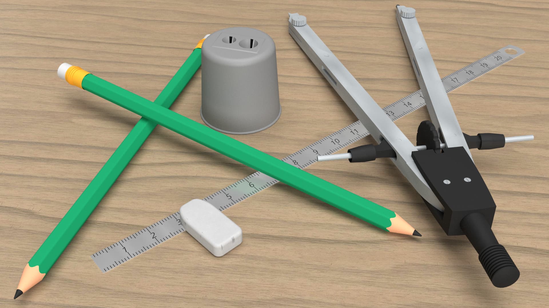
It’s annoying that the pencil sharpener looks like it’s floating in the air, but anyway…
Any suggestions on how to make it look better, more realistic?
In Dimension you can expand the model in the Scene panel, use the visibility to hide and show things until you are sure you have the sharpener selected, and the use the Move to Ground button to move just that part of the scene to the ground.
If you could add your model to a reply I can try to show you what I mean.
I guess it’s an illusion. Here’s the picture with the pencil raised a bit. The sharpener looks on the ground, but now I’m noticing a white line to the right of the left pencil. If I zoom in there isn’t really a white line there.
It’s not noticeable when zoomed in. I think that the tail off of the shadow is enough darker than white, that the abrupt change makes it seem like the part not under the shadow is brighter that the part slightly further away from the shadow. The shadow could feather better.
If I use the screen eyedropper and compare the RGB value of the brighter looking part against the pixels to the right of that, the values are the same, or the pixels to the right are slightly brighter.
They use similar rendering techniques, but may do a better job of shadows. You could compose the picture slightly differently to avoid the problems. Also, give the ruler some thickness.
I am rendering a new version that uses softer lighting. Will add that when it’s ready.
It’s got something like 1 millimetre, but you’re right, I should have put more; it looks completely flat on the render.
Interesting, I didn’t tweak the lighting but just went with the ‘normal’ lighting.
I did have to drop the general light for the render with the maths under, as otherwise the picture underneath was saturated and spoiled.
Here goes then.
There’s two set-ups, the one near the origin of the model is the one I imported into Dimension. Ignore the compass that I’m working on, hopefully I’ll add it into the scene once I’ve finished it. Rendu Crayon (1).skp (2.8 MB)
Here’s a new version with the finished compass. I realised that the scale of everything was wrong, now it’s more real-life size.
I’ll have to wait until Monday to get a bigger image of those maths. Rendu Crayon.skp (3.0 MB)