CorelDraw gives many options when exporting to SVG or other formats so I did not know what settings was compatible with SketchUp. Now I know thanks to mark12
good idea! I’ll try that outer box too.
For what it’s worth the new logos are much better than the old. Far more sophisticated. Once you see the methodology behind them (Layout = layers, Sketchup is an “S” and a “U”) it. becomes second nature to go to the right one.
That’s an interesting point that you can see letters in them. I’ve not noticed this so I went back and took a 2nd look. I guess if I look really hard there’s sort of something I can see. But again, I’d much prefer something easy to see. I’m using SU around 8hrs/day, 5 days/week and if this is not enough to make it intuitive for me then I feel somethings got to change.
Well…
The Layout and SketchUp icons are pinned to my taskbar.
Did I have trouble identifying which was which ![]() I’m not sure, but what I do know is that before the icon change the Layout and SketchUp icons were in swapped positions so I was actually clicking the wrong icon because of my muscle memory. Now it’s second nature which is which.
I’m not sure, but what I do know is that before the icon change the Layout and SketchUp icons were in swapped positions so I was actually clicking the wrong icon because of my muscle memory. Now it’s second nature which is which.
As for the 3D Warehouse, Extension Warehouse, Send to Layout and Extension Manager icons…
I’m not browsing and downloading from the Warehouse frequently (in fact hardly ever). For sure it’s going to be part of others’ workflow but I’d rather open 3D Warehouse directly in a web browser and as for downloading into your model, well that’s not really good practice is it. The advice is to open the Warehouse model separately, check it out and clean it up before using it.
(and if I was using 3D Warehouse more frequently I’d have a keyboard shortcut)
How often does one need to browse the Extension Warehouse…?
Send to Layout I’d suggest is not the best workflow.
And how often does one need to open up the Extension Manager…?
I have a minimal workspace - almost full screen ![]() so I’m not really interested in icons just shortcuts
so I’m not really interested in icons just shortcuts
Just saying.
You’re right about the frequency of use. I mostly use the 3D warehouse button, then download the model for cleanup. The others get rarely used.
I guess in my original post for this thread was thinking about the icons in the taskbar on my desktop, not the icons in the application tray. The desktop icons get used far more frequently as I’m constantly flipping back and forth between different files and applications. That’s why I changed them to a simple red S and blue L…so much easier for me to quickly identify in the taskbar.
Totally agree!
Arguably, that’s never the case; form always follows function. For example, what is the true purpose of the furniture, or the red car? If it’s to impress people, then it doesn’t need to be comfortable or fuel efficient. If you don’t use them often, then treating them like glorified art pieces is (arguably) just fine.
But in the case of the logos… I’m not sure. I also have a tough time not opening the .skb or “Backup” layout files instead of the originals sometimes. For the .skb files, I right-click >> Open With >> Notepad, and set that as the default, so I can easily tell them apart.
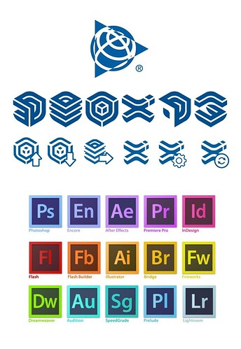
It’s clear the designers were instructed to create logos in the Trimble family.
I just wish they were simpler and more recognisible…like the Adobe family.
Totally agree, sometimes it’s very frustrating and time consuming!
KISS “Keep it simple stupid” is my motto ![]()
Agree.
Here are 4 new buttons I use. They are basic but do the job for me.

For anyone that wants a quick fix, the files are attached here.
For Windows, just copy to:
“C:\Program Files\SketchUp\SketchUp 2021\Images”
For Mac, please search the thread above for specific instructions.
icons.zip (3.9 KB)
Wow, those are bad. Not psychologically distinct, not visually distinct, don’t really express what’s going on.
As a professional graphic designer I can appreciate the time and effort into building the new system and making it cohesive and consistent with the new visual identity, which is not easy at all.
Also as a professional designer, I agree that a lot of this criticism is absolutely warranted. The new icons/logos are hard to distinguish, and therefore actually function opposite to their intended function. A rework makes sense from a design and legibility standpoint. People here have elaborated on this quite well.
maybe it would have been sufficient to have the ol’ icons as a blueish version in the Trimble color…

I disagree … mark12 icons are visually distinct and very expressive. Maybe the icons are too colorful to me, but very distinct and expressive.
