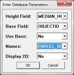
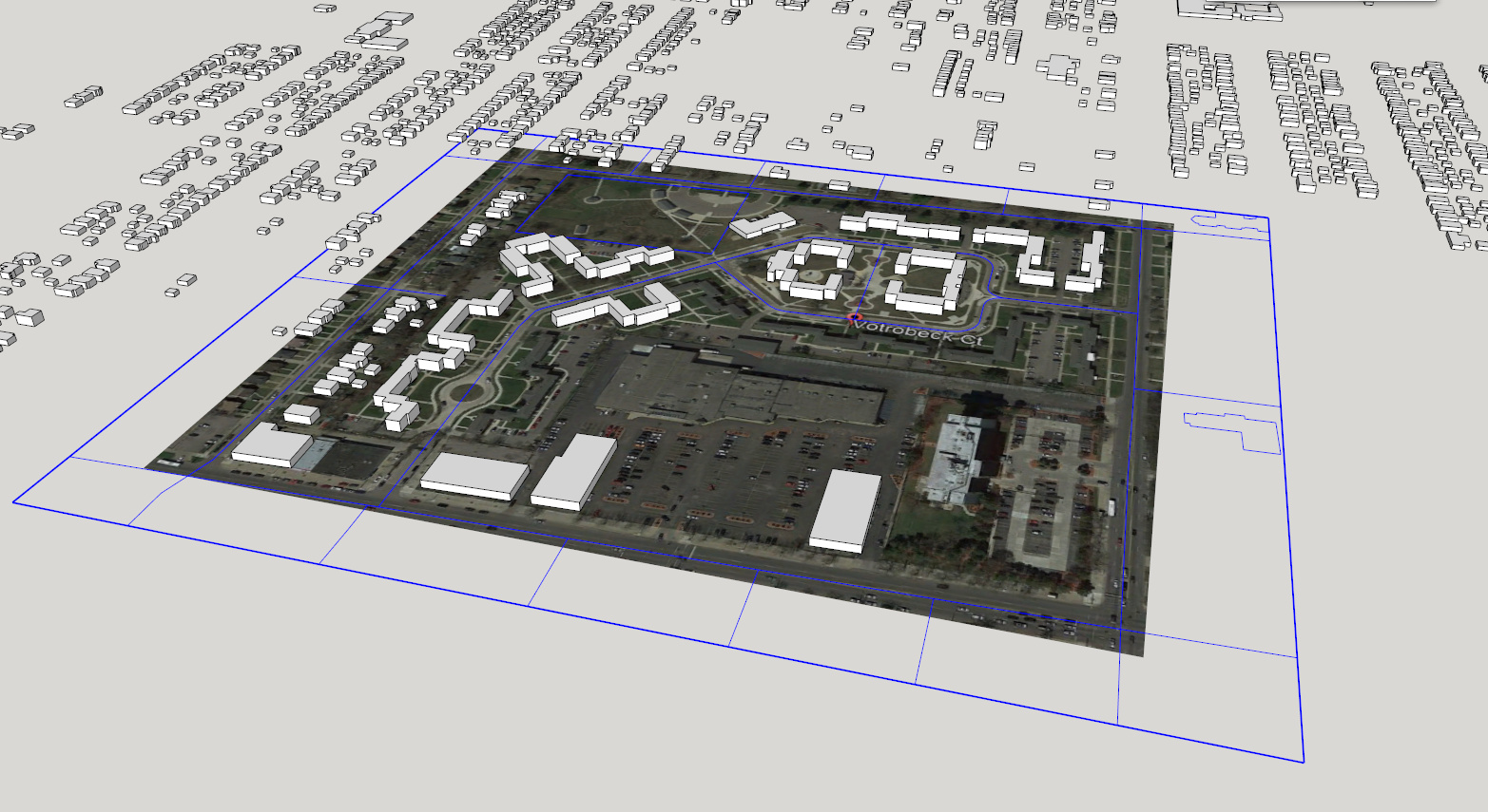
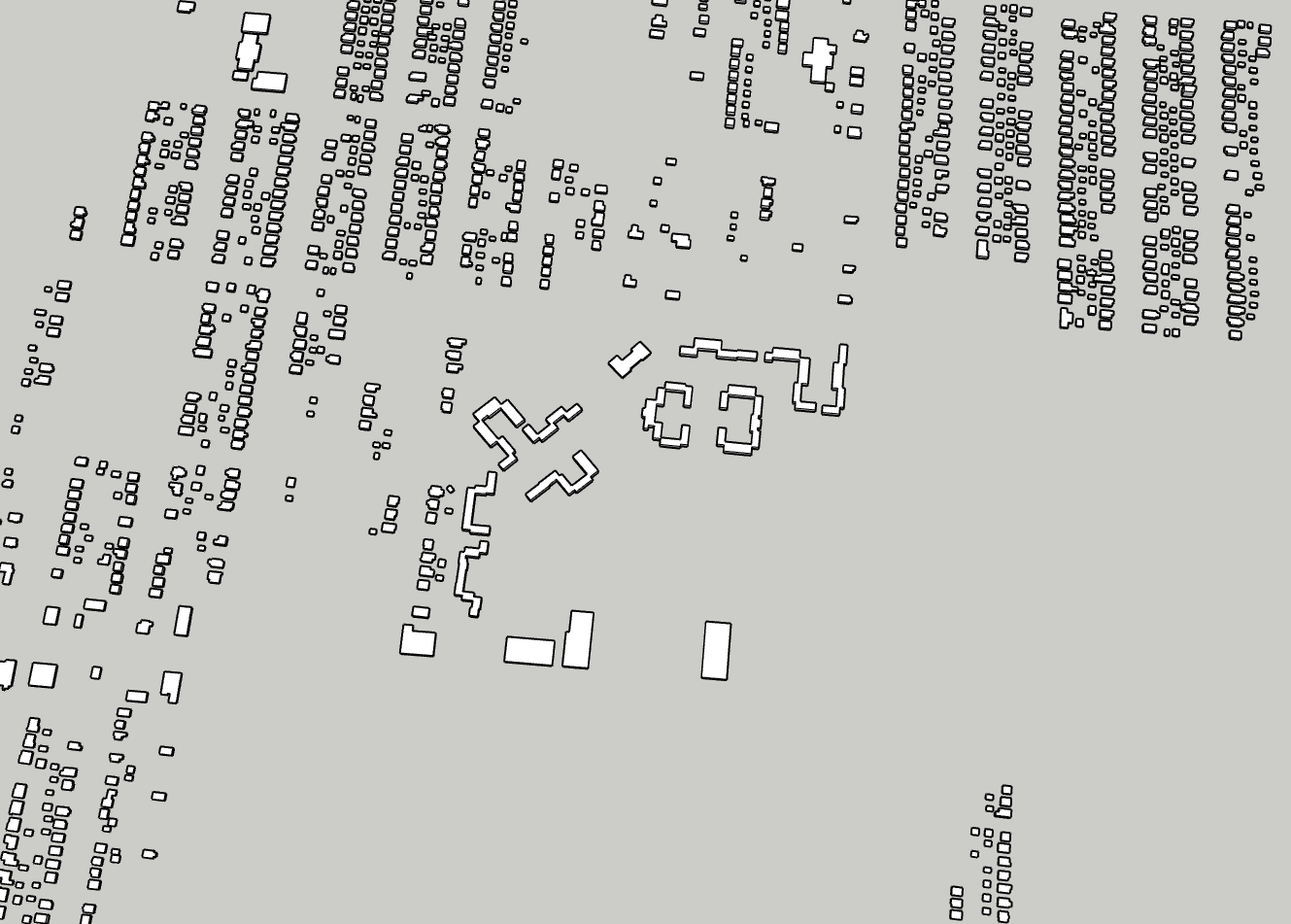
Yes, I was able to do the 4202 buildings no problem - thanks for walking me through the parameters options - very helpful!
The MEDIAN_HGT column is apparently the “median height in feet from 2008 LiDAR data. A value of 0 indicates that the median height is unknown”.
The STORIES column is “Number of stories. For single family residential this number is expressed in quarter fractions from 1 to 3 stories: 1:00, 1.25, 1.50, etc.”
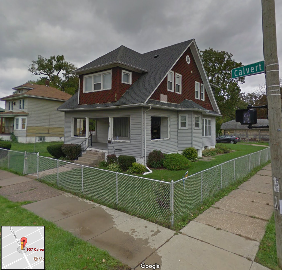
For, for example, the property located at 957 Calvert has the following numbers:
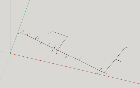
The structure itself looks like this:
Is this really a 1 story building with median height of 24’?
I think the LiDAR data is measuring all of the heights of the structure for every square in of the footprint, and then calculating the median (so, the abundance of porch roofs alone would distort the heigh values of the housing stock in Detroit). I think the # of stories is the result of some algorithm that determines how many feet above ground the roof starts at. Since 957 Calvert has a roof that “starts” at the top of the first floor, it’s called a 1 story house.
I wonder if there’s a way to use these two separate data points per property to create a higher degree of resolution? Not sure, but maybe it says "if a building type is single family residential and the roof starts on the first floor and the median height is over 15’, then the shape of the structure is probably a semi-a-frame house (or whatever you call the specific style of architecture 957 Calvert is).
Would love to hear your thoughts on this!
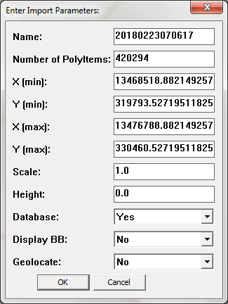
So, back to the original question, if I can get 4202 building shapes to work, how can I get the rest of them? Looks like I can target specific areas at a time - should I just take that route, or is there a more systematic way of doing it?
Also, how are you determining Xmin, Xmax, Ymin, and Ymax? I’m assuming those are the 4 corners of a target area, but in what format is 13468518.8821149257? I’m going to try some google search to figure it out in the meantime
I managed to import my neighborhood, but now I can’t seem to get the SEMCOG Building Shapes (white) to line up with the parcels (multi colored rectangles) or the shapes I have from the OpenStreetMap import (yellow). It’s weird, for certain buildings I have the EXACT dimensions of - for example 7432 Brush St. because we own that - and if I group all the semcog shapes and move it by the 7432 brush building shape to line up at the exact same point, they line almost perfectly - within 3 inches of any side kind of thing.
I just took a measurement and it looks like the semcog shapes aren’t perfectly square within themselves. As in, they are like trapezoidal within themselves.
How can I get these to work within themselves better? Here’s a link to the file in google drive for convenience: North End Masterplan alignment.skp - Google Drive
note: the parcel dimensions aren’t perfect, but they were the closest I was able to get w the shape file importer. I’d love to be able to get everything plum, level, and square (or at least as much as possible)
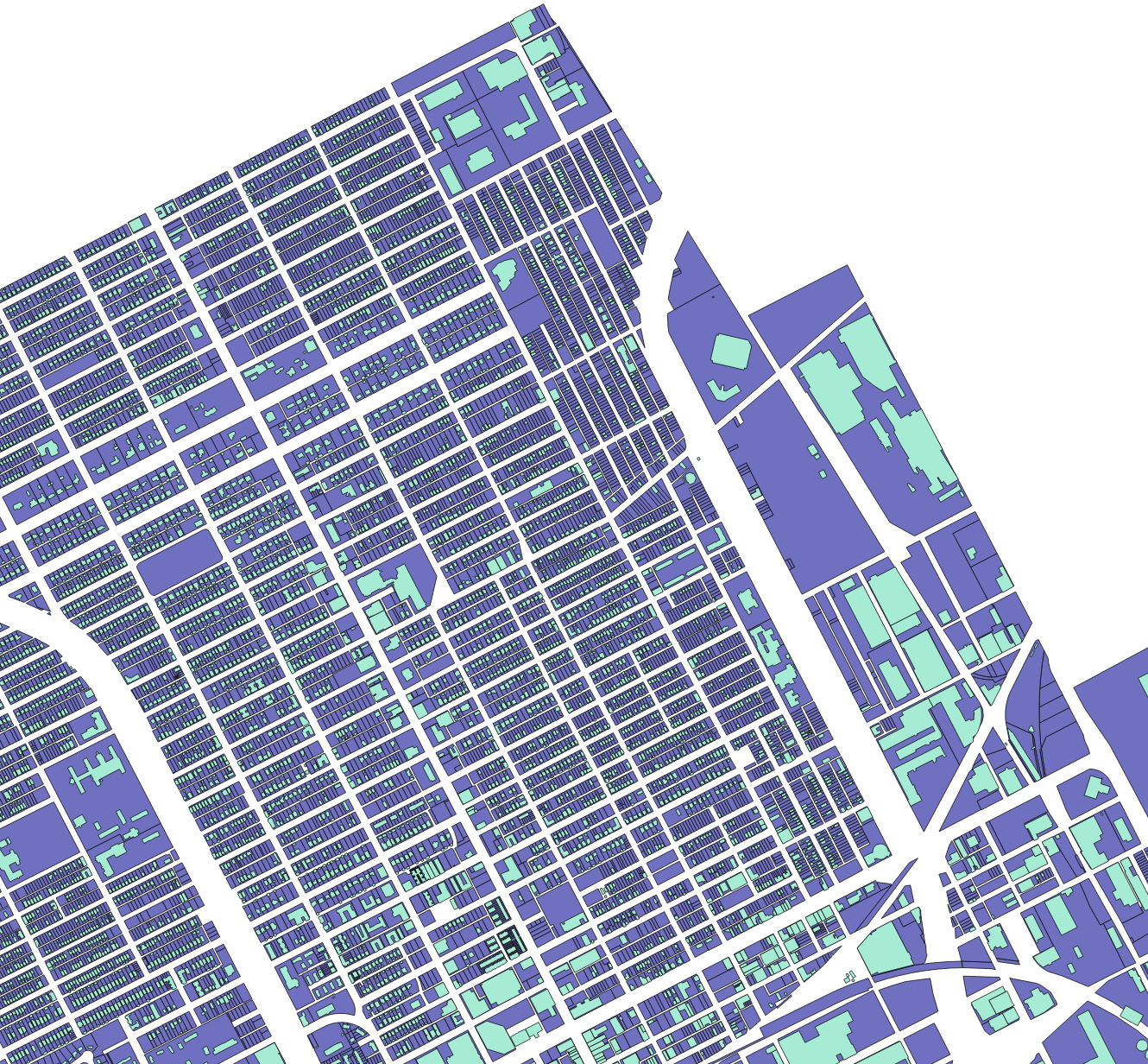
Update: I’ve managed to get the shape files for all of the parcels in the City of Detroit and all of the SEMCOG shape files to align really nicely in GQIS and AutoCad (see images)
Now I just need to be able to figure out how to do this in sketch and my life will be complete
Also, and sorry for all of the questions, but do you think it would be possible to add a feature to the shaprefile importer that would allow one to import different colored shapes? So, for example, if one had done a property condition report for all of the structures in a defined area and had a column labeling the condition for each object as “1” (bad), “2” (stable), or “3” (good), could that number be used to color all of the shapes? Theoretically, you could also do the same when importing the parcel files as well, which would allow you to color code those differently (i.e. color code the parcels by ownership - so that you could visualize the distribution of blighted properties that were owned by the City government or something). That would be a really amazing data visualization strategy