Oh please. All of the ease of use is still there unchanged. It’s just refinement.
You’ll never get a response or explanation from Trimble of why or when they will do something. I’m not the biggest fan of the new icons design but after several months using them I’ve learnt to adapt, just like the notch of my MacBook, at the beginning it was something that called my attention but now I don’t even tell it’s there.
Not that it matters much, but my adaptation is that I don’t even look at the icons. The entirety of my main modeling tools are mapped to the keyboard and do not exist in my workspace as visual buttons. Nearly every tool change I make is done on a keyboard now (my right hand on the mouse is totally independent). Am I alone?
I have very few icons of native tools, most of the native tools I have also assigned a shortcut, the only ones I have are the axis tool, the polygon tool, 3D text and labels, dimensions, and the extension warehouse, send to layout, 3D warehouse and extension manager, I almost forgot the styles toolbar as well.
That almost exactly defines my workspace ![]()
But you still have to see the new tool cursors icon which is why I’ve stopped using native tools where possible.
Is it a possibility your monitor brightness is set too high? Mine is waaaaay down, in single-digits
Perhaps the new tool icons for SU 24 will be all circles of slightly different diameters, very elegant. Or, all versions of the SketchUp logo, in a variety of blue colors? Cerulean for follow me, periwinkle for offset…. All very “on brand”. Whatever it is, we will adapt. ![]()
I used SketchUp from 2002 (more 20 years). And it first published by @LastSofware, not Google. For me, the new icons are not bad, something even better.
For your reference:
I am also not a fan of the new icons. They are too similar and dont stand out and i find it harder to point at things specifically since they dont always have a clear point or tip of the icon.
My opinion is that the new icons and the UI in general look like a pair of washed (pre-worn) jeans. It may be trendy, but it’s not pretty.
However it’s not a deal-breaker, but considerably negatively influencing the usability for me.
Perhaps it should be concluded that I have become a grouchy old man. But it is also possible that UI developers are not angels either. Or rather both.
Grouchy old angels!?
UI developers are not angels AND I’m a grouchy old man (and an angel). ![]()
I think the reaction to the new icons depends on the age of the eyes looking at them. UI designers tend to be young(er) and not yet at the stage where their eyesight has begun to dim.
For older users (myself included) it’s definitely a step back in usability, even if the new icons look less dated and more coherent with the other new(ish) UI elements — such as the icons for LO/EW/3DWH — which I also find too indistinguishable from one another.
It would seem an easy fix to simply add a preferences toggle for the user to choose between the two icon sets, but I doubt that will become an option.
I get it I was being idiotic about someone mythical who had changed the icons when i should have been even more genetic or indeed as i now have amended the comment to me being an idiot which I guess is OK. Still dont get why change is seen as an improvement or a need but hey i’m just a customer.
Yes love to see a PC screen grab is its was near what is now or was as its not now if that makes sense!!
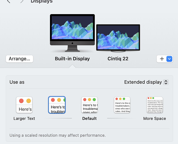
Being one of those whose users eyesight 'aint what it used to be…there’s two things I recommend that may be even better than going back to the old icons. 1. Screen resolution. On my Mac I don’t use the default resolution. Not only does this help my ability to read small text and icons but this also helps with my training videos making it easier for my audience to see what I’m doing on screen.
And 2. Keyboard shortcuts. I’m old school in that I learned CAD back in the day from a guy who didn’t use a single toolbar icon. Everything was command based and he was fast! It blew my mind how much better he was by NOT hunting down icons or rooting through menus for everything. I don’t need to use a single tool icon anymore but do of course when I make videos so newer users can follow along.
It looks so clean and minimal! Something the young kids might say is hip these days:
While neither suggestion solves your initial problem of liking the old icons better…both will help make your workflow faster and, to me, more enjoyable. Isn’t that what working in SketchUp has always been about? Freeing, Fast and Fun! Cheers.
Ah, some helpful, constructive feedback. Thank you. I started to checkout keyboard shortcuts and noticed that not all tools have one. Does Sketchup allow one to assign additional shortcuts?
Thank you.
Dave
so any typos are due
to large fingers & small keys.
Yes, you can re-assign any existing shortcut to be any key or combo you want and assign additional ones to almost any command. Look in preferences>shortcuts.
Thank you.


