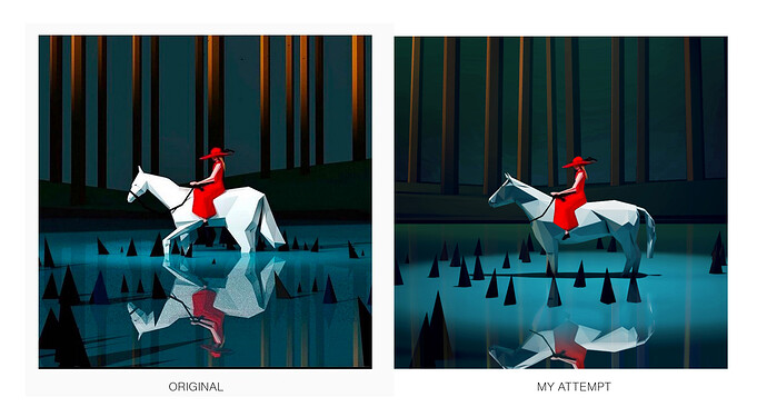
Been awhile since I shared any non-SketchUp-Campus-related content here in the Forums so the following is what I hope to be the first of a series of low-poly models in order to beef up the old ‘concept/game art’ design skills.
My usual starting point when self teaching/designing is to begin by researching and finding good sources to get inspired by…in this case: Low Poly Molly’s work on Instagram. (btw I’ve heard that imitation is the highest form of flattery).
Now to recreate. Step one, since time was short here on my lunch break I started with a horse from 3DW and reduced polygons by 85% using Artisan. The original horse had about 13k polygons whereas the reduced version was down to just over 2k.
Next up was the environment. This was pretty easy as it consisted of only 4 elements: swamp water and spiky stumps in middle-ground and swamp land and tall tree trunks in background.
Here’s what it looked like when viewed from eye level at a similar composition as the original. The trees were made from extruding a hexagon shape from the polygon tool and the ground plane was just manually pulling a vertices. And trees and spiky stumps were placed randomly using Skatter and adjusted slightly to get the distribution right.
Next I popped open V-Ray for some super quick materials and lighting adjustments. 3 spot lights added. One directly over the horse pointing down and the two others angled towards the trees in the back. The back spots were given a warm color tint while the spot above the water had a very light blueish-green added with the hope to pick up some ambient light bounce back onto the horse.
Here is the render as it came out of V-Ray with mostly default settings (meaning that I did turn on ambient occlusion and did some basic exposure corrections as well as added a vignette to the camera). I knew some more color corrections might still be needed so while I try to do everything in SU+V-Ray, it’s really more like 80/20 = 80 (SU+V-Ray)/20 (Photoshop).
Finally, for comparison (original on left and mine on right), the first version is straight out of V-Ray and the second one below that is with the addition of some color corrections and because I’m lazy, I magic-wanded the ‘lady in red’ and just plopped her on top to finish things off.
In summary, not a perfect match as you can see but I learned a few things along the way and isn’t that the point after all? Looking forward to continuing this experiment and posting episode 2 in the near future. Happy Friday.


