sorry for the delay
was busy, then was ill for a few days and ended up with a backlog, so was busy again
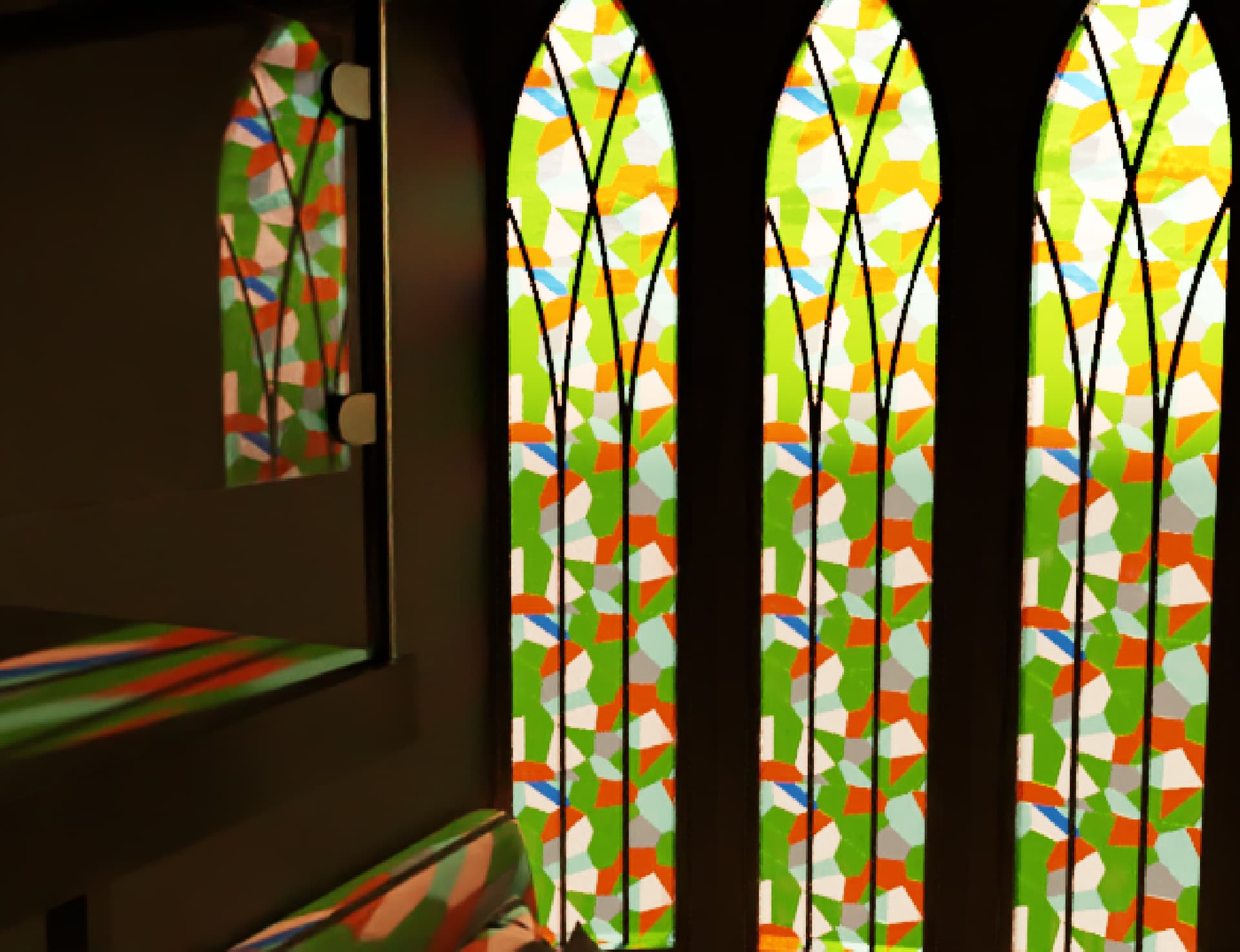
Following on from where you are - going for artificial lighting only
Beyond the tips and tricks others have given you - I’ve made a few changes - the wood looked strange to me, the scale of it seem too large and was kind of distracting. I did try adjusting the scale, but found it was easier and quicker to get a better result by swapping to another material from cosmos.
I’ve also rotated it so the wood grain runs vertically, this looked better on this tall furniture.
The materials in the room are very white - mostly too white.
Rule of thumb - White should look like light or mid grey in the colour picker and black should look like a charcoal grey. This prevents errors in the lighting and reduces contrast. I’ve done this across the model, from the desk to the marble floor to the wall paint.
I’ve also made the white walls a little warmer in tone to match the bedding.
I also had a little more creative adjustment of the scheme - to my eye it really does feel like there needs to be something hanging or on the papered wall.
So in this example I’ve grabbed a vaguely ok light fighting to help fill that double height space.
I’ve also tried to fill out some of the white space with the poster and the additional wallpaper around the desk.
I looked at a couple of rugs on the entrance area - I could imagine the acoustics in this room to be poor as it is visibly mostly hard surfaces - this would help to soften the sound, the hardness of the other materials and also remove some of that visible whiteness from the overall shot.
In terms of additional settings - I’ve turned on depth of filed in the render settings and added a little bit of foreground blur.
I’ve also enabled the volumetric environment to fill the room with a little light fog - this also helps to give lighting shape in the photos.
In the frame buffer
Filmic tonemapper and change it to AMPAS (or Hable if you prefer!) - don’t need to touch anything else.
This is SUPER important, you should always turn it on.
This will help eliminate get rid of a certain set of colour and brightness errors that I see all the time.
I’ve also turned on the lens effects to add some a little bloom and glare around lights
Exposure and whitebalance I’ve set to my taste.