Darn I’m still using SU17 so don’t have a clue to what’s going on. Don’t know about the Titanic allusion though, is there something about SketchUp others might want to know?
The new cursor icons are horrible in my opinion. They cover what you’re working on. They’re less precise - as in it was easy to clearly see where the eraser icon click point was. It was inside a clearly visible circle. Now that circle is so tiny and low contrast compared to the rest of the cursor, that you just have to know where it is in relation to the giant eraser icon…which by the way is actually LARGER than the icon in the toolbar. Never have I used a piece of software where that was the case. It’s clunky, ugly and borderline unusable. The various arc tools’ pointers along with the follow me tool pointer are indiscernible from each other because there’s a red dot that is clearly visible, along with a light blue arc. The light blue arc is so desaturated and close to midgray that it disappears in shadows and anything gray (most of the model if you’re modelling in default white) that any discernible difference completely disappears. What tool do I have selected? Who knows.
Terrible, terrible design decisions all around. If you guys need help, talk to the Blender crew. The guy that designed their iconography did it for free. Maybe you guys could wave our subscription fees for a few months since you completely wasted your money and our time with this poor design.
Don’t get me started on the myriad of bugs that have been hurled on us. These items will not be fixed in 2023. There will be no more incremental versions until 2024 releases. YAY! subscription model for the win! FFS
what a sound advice ! you just solved every bad UX cases in the software industry ! talk to the blender guy and get someone to do it for free !
but… but how do you know they’ll do a good job ? as the french says, “you’re never served as well as by yourself”. time to learn UX design Daniel !
yes. Yes it is sarcasm. here is my sarcasm light. ![]()
Considering the tone of the above message, it felt required.
You’re allowed to be anger. being a duck about it is optional.
it’s ok, report it as spam, I won’t mind. I’ve made peace with it.
That’s not sarcasm, homie. That’s what you call ignorance. I worked in ux/ui for 13 years before I switched careers from software development to mechanical engineering. So, my criticisms come from a place of fairly deep knowledge. I was also somewhat involved in the development of blender 2.8, and have interacted with the vast majority of the development team. While the fella who designed their icons and cursors was not one of those people, it’s VERY clear that he did a far better job than the hack job that this paid developer did. The blender team worked closely with heavy users of the software (me included) to come to a design that worked well, didn’t disappear into neutral colors in the viewport, and clearly conveyed which tool you were currently working with and what area of the ui you were interacting with. So, yes the guy working for free did a job miles miles beyond what the Trimble peeps were able to come up with (that’s km for you euro folks).
Beyond this, I’m 100% confident I would have done a better job. Yes I said that. I know for a fact that myself and an unpaid programmer would have done better.
Having worked in software development I was able to identify the issues with the current design while also exhibiting my disgust with the fact that since Sketchup went to a subscription model that the quality of the software has declined. Pretty neat, huh? I guess having spent so long being educated in multiple disciplines will let you kill two birds with one stone like that.
So while I was being helpful your worthless comment did nothing but turn on a ducking “sarcasm light”.
Would be interested if you posted a few examples of what you would do to change the icons?
The 2022 icons werent perfect.
I dont mind the new “look”
But i do hate the fact that the Eraser tool has its selection point moved from 2022 to 2023…that’s a functional change, not a visual one.
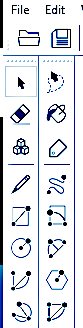
I’ll play. I don’t have time of course to redesign each icon, but 30 seconds of photoshop gets me a set of Icons that I can easily see and distinguish on my screen using the existing SketchUp logo blue as a base color instead of the latest low contrast light blue. Boring of course, but I could work like this.
I’m hearing different complaints for different reasons.
- i like traditional character (or dont want to re-learn new ones)
- too low contrast
- too similar to each other
- no need for change / dont waste time on this
I personally find high contrast ones a bit visually jarring (maybe the background is too bright?).
And I think the red colour adds some character (similar to the 2022 icons and traditional (s)ketchup theme).
But this makes me wonder what people are doing with monitor settings.
I know “blue light reduction” mode is a thing, as is low contrast (to reduce eye strain)
Maybe the light blue is getting muddied by those settings?
Thanks Sam. The new tool icons are all too similar, too small and all the same colour. Do you know of any way to re-set the tool icons to a different ‘look’?
If this is what you are all worry about, great.
Sketchup isn’t perfect and will never be perfect. There is a lot of software out there that costs a lot more and still have issues. I would be really happy, if the icons would be the main problem of sketchup!!
Unfortunately there are many issues, that count more. Especially Layout.
And issues regarding workflow, windows that every time have to be repositioned, reopened to be updated ecc.And yes, I agree that the Icons change is not the best thing happened, but doesn’t disturb me at all doing my work…
There doesn’t appear to be a way to get the classic tool / cursor icons back.
In Layout I have copied the previous svg files over to the new installation folder – it works but not for SketchUp.
In SketchUp my extensive use of Curic’s DIO2 prevents me from seeing some of these new icons and I’m seeing if I can work Fredo’s Move extension into my workflow.
That leaves the orbit cursor – I’ve tried messing about with the API but no success.
Thank you very much for trying. No big issue, I am sure I will get used to it.
Designers know that there are a few basic principles that need to be followed to communicate clearly- Rules of thumb.
A professionally designed user interface should maximise differentiation- It should provide instant recognition of a unique function in contrast with other functions.
To put it another way, here are four tests for a good UI button design:
Maximum:
- Contrast.
- Differentiation.
- Uniqueness.
- Recognition.
The old icons worked well on all four counts
The new icons don’t.
I would argue that the new buttons are a style decision not based on rational consideration. However I’d welcome some statement from SketchUp on the issue. This is important for SketchUp, despite comments above. It’s the UI we’re talking about here. It’s how we interact with SU. I can’t understand this change. It makes no sense.
Le_Corb has hit the nail on the head…A redesign can be great and I personally don’t mind the icons design in themselves, except for the very important fact that I can’t see or distinguish them clearly and they now impede my workflow… I am quite happy getting use to UI changers etc but on a HI DPI screen they are not easy to read (also why does a pencil appear whilst using the measuring tool?). Sketchup, keep the new icons but please make them easier to use in line with the post above
thanks
Dan
I’m in my 50s, wear glasses and don’t have an amazing monitor, yet I can see them clearly.
Is it the way monitors are set up? The default windows theme colours?
There’s got to be a reason why some people are not seeing them clearly and others are.
Surely once you know where an icon is, it’s committed to memory anyway.
There is color blindness associated with both blue and red colors so that might have something to do with people having issues with the new icons
What might (just might) confuse the Sketchup-Team about this discussion is, that these icons have been available on Web and iPad for over a year without us making such a fuzz about it. Why now? Maaaaaaaybe, just maybe this gives us an indication of how much we “pro” users are interested in the Web and the iPad version. It’s not that I hadn’t seen them before - I just thought: well, I don’t need to worry about these (just yet). Well - the day has come. ![]()
What you did here is just increase the contrast ![]() - it’s THE basic rule and the main problem with the blue in the icons. The red dots are actually fine, but the blue against the white are (measurable) to close together. It would solve the issue in a blink of an eye but I don’t think they will be changed back.
- it’s THE basic rule and the main problem with the blue in the icons. The red dots are actually fine, but the blue against the white are (measurable) to close together. It would solve the issue in a blink of an eye but I don’t think they will be changed back.
Another reason some people are having issues and others aren’t. Sketchup uses the builtin ui libraries for windows and Mac. They each handle icons and pointers differently.
This was a lazy move on the part of the su team. They should have fixed this fundamental issue early on since it has impeded their work since they have to have more unique code per platform. Swapping to GTK or another cross platform UI toolkit would cut down on coding and also make the ux consistent across platforms.
I tried the Mac version since that’s what type of computer I prefer, but the differences were so vast I couldn’t get acclimated and ended up buying a new laptop.
On the Mac, nothing is dockable. Each of the trays is a separate window. (Edit: actually each component that might go in a tray is a separate window. Materials, components, outliner, match photo: all individual windows.) There can only be a single row of icons at the top of the main window (none on the sides or bottom) any other toolbars also have to be in separate windows. Compare this to the pc version where everything can fit in one window.
But like I said, icon and cursor rendering happens very differently on each platform, so our inconsistency is due to bad design choices that in 20+ years have not been corrected.
Just updated to 2023 on Windows and I like the new icons.
I don’t have an iPad and don’t intend to get one and if they created an Android version of SketchUp – am I going to start modelling with it seriously ( or even not seriously ) – I don’t think so.
Have I used the web app – no.
I use SketchUp for work and for me that means a desktop system with the functionality of extensions.
So, I have not experienced the “new” iconography although I have been aware of it.
For me it’s not the contrast, or my monitor setup or my 55+ eyesight – to me the icons are just utterly… utterly… I can’t find the words.
The classic icons have character and depth.