I’ll be posting here:
- Random works
- Extensions comming updates
- Concept ideas
- Extension dev process
- A bit of vent
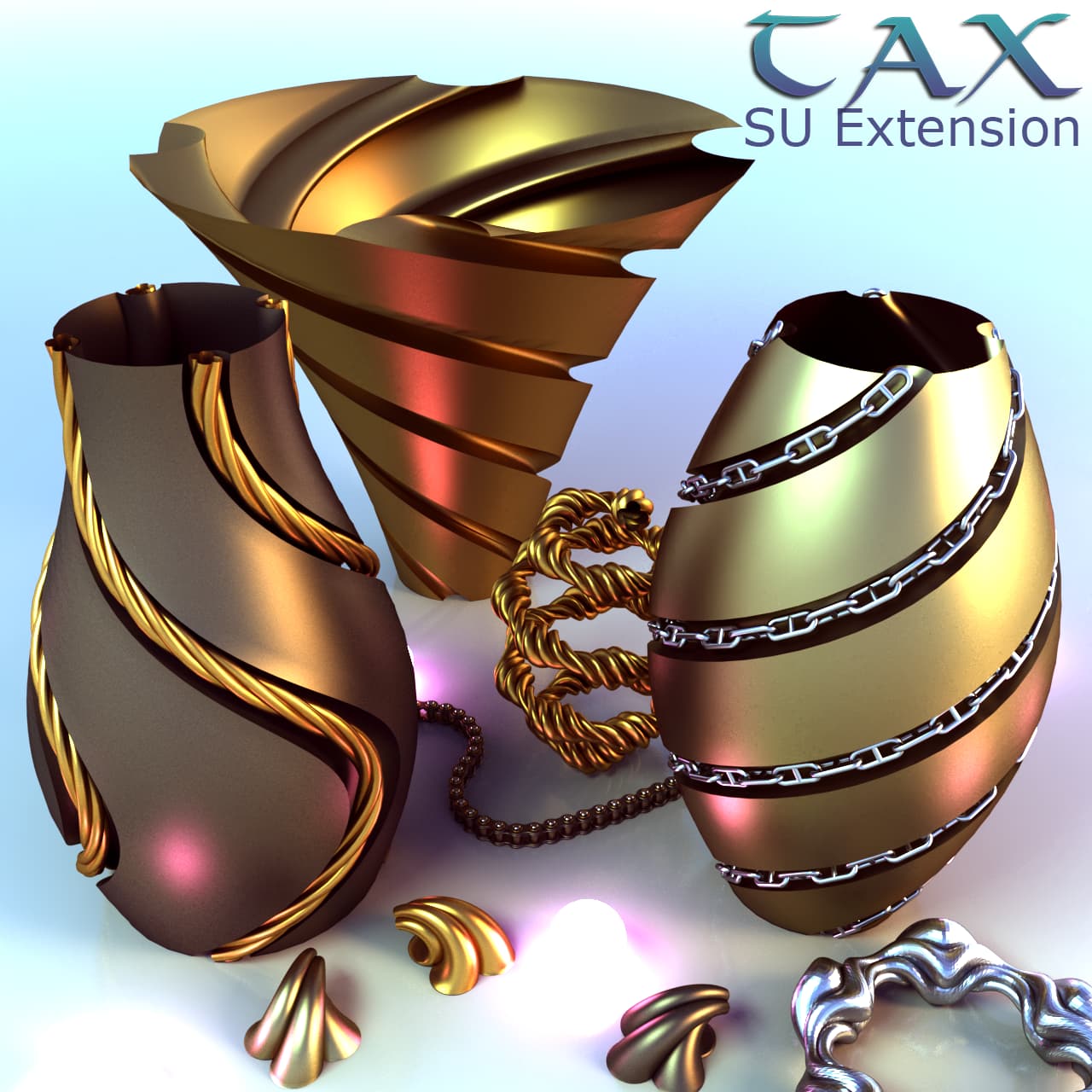
Currently published extensions:
- Tax Engineering v10.7
Download: Tax Engineering | SketchUcation
Support tax: (Donate)
I’ll be posting here:
Currently published extensions:
Support tax: (Donate)
wouldn’t it be simpler to insert screenshots directly instead of photos?
Yes, I would love it
The thing is there is some communication disfunction somewhere in between there and somewhere. Cant rlly have a reliable external connection these days.
So im using my smartphone instead pc for net browse. Im rlly sorry for bad angles and weird gamma effect.
Gonna try to make it more stable.
Also I gotta tell u ur renders looks more real than reality itself. Great work.
If u want, I can publish some of these weird shapes so u can add on ur scenes as a plus.
Would be amazing to see it.
Thx for feedback 
Why don’t you use your smartphone as a WIFI hotspot to connect your PC?
Things gets weird with any connection.
May be some malware, so Im avoiding it.
Time for an upgrade anyways 
It also has a bit of @Box style if you ask me. 
Sure!
Guess he uses vray srgb workflow and likes crazy geometry as well.
Pretty Modus UI comming soon!
My reference code: (Dropdown button not working, not sure why)
dialog = UI::HtmlDialog.new({
  :dialog_title => "my Modus UI reference",
  :preferences_key => "com.sample.plugin",
  :resizable => false,
  :style => UI::HtmlDialog::STYLE_DIALOG
})
(html = "

<!DOCTYPE html>
<html>
  <link href='/modus.min.css' rel='stylesheet'>
  <body class='m-3 bg-panel-background'>


<div>
	<span class='badge badge-pill badge-primary'>1</span>
	<span class='badge badge-pill badge-secondary'>2</span>
	<span class='badge badge-pill badge-tertiary'>3</span>
	<span class='badge badge-pill badge-dark'>4</span>
	<span class='badge badge-pill badge-success'>5</span>
	<span class='badge badge-pill badge-danger'>6</span>
	<span class='badge badge-pill badge-warning'>7</span>
</div>


<div class='modal-footer'>
	<div class='dropdown'>
		<button class='btn btn-primary dropdown-toggle' type='button' id='dropdownMenuButton' data-toggle='dropdown' aria-haspopup='true' aria-expanded='false'>Mode</button>
		<div class='dropdown-menu' aria-labelledby='dropdownMenuButton'>
			<a class='dropdown-item active' href='#'>Action1</a>
			<a class='dropdown-item' href='#'>Action2</a>
			<a class='dropdown-item disabled' href='#'>Action3</a>
		</div>
	</div>
<button type='button' class='btn btn-primary'>Open </button>
<button class='btn btn-primary' data-toggle='tooltip' data-placement='top' title='Button Tooltip'>Button</button>
<button class='btn btn-danger'>Delete</button>
</div>


<form id='dlg-content-area'>
	<div class='form-group'>
	<label for='Input4'>Input with a button</label>
		<div class='input-group'>
		<input class='form-control' placeholder='Placeholder Text' id='Input4'>
			<div class='input-group-append'>
				<button class='btn btn-outline-secondary'>Go</button>
			</div>
		</div>
	</div>

	<div class='form-group'>
	<label for='exampleFormControlSelect1'>Custom Select Outlined</label>
		<select class='custom-select form-control' id='exampleFormControlSelect2'>
			<option>Option 1</option>
			<option>Option 2</option>
			<option>Option 3</option>
			<option>Option 4</option>
			<option>Option 5</option>
		</select>
	</div>

	<div class='form-group'>
		<label for='dpi'>DPI</label>
		<input class='form-control' id='dpi' placeholder='300'>
	</div>
</form>


<label for='customRange1'>Example range</label>
<input type='range' class='custom-range' id='customRange1'>


<div class='form-group'>
	<div class='custom-control custom-checkbox custom-control-inline mr-3'>
	  <input type='checkbox' checked class='custom-control-input' id='exampleCheckboxInline1'>
	  <label class='custom-control-label' for='exampleCheckboxInline1'>Checkbox 1</label>
	</div>
	<div class='custom-control custom-checkbox custom-control-inline mr-3'>
	  <input type='checkbox' class='custom-control-input' id='exampleCheckboxInline2'>
	  <label class='custom-control-label' for='exampleCheckboxInline2'>Checkbox 2</label>
	</div>
	<div class='custom-control custom-checkbox custom-control-inline mr-3'>
	  <input type='checkbox' class='custom-control-input' id='exampleCheckboxInline3'>
	  <label class='custom-control-label' for='exampleCheckboxInline3'>Checkbox 3</label>
	</div>
</div>

<div class='form-group'>
	<div class='custom-control custom-radio custom-control-inline mr-4'>
		<input type='radio' checked='' class='custom-control-input' id='exampleRadio' name='exampleRadio' value='customEx'>
		<label class='custom-control-label' for='exampleRadio'>Radio 1</label>
	</div>
	<div class='custom-control custom-radio custom-control-inline mr-4'>
		<input type='radio' class='custom-control-input' id='exampleRadio2' name='exampleRadio'>
		<label class='custom-control-label' for='exampleRadio2'>Radio 2</label>
	</div>
	<div class='custom-control custom-radio custom-control-inline mr-4'>
		<input type='radio' class='custom-control-input' id='exampleRadio3' name='exampleRadio'>
		<label class='custom-control-label' for='exampleRadio3'>Radio 3</label>
	</div>
</div>


<div class='form-group'>
	<div class='custom-control custom-switch custom-control-inline mr-4'>
		<input type='checkbox' checked class='custom-control-input' id='exampleSwitchInline1'>
		<label class='custom-control-label' for='exampleSwitchInline1'>Switch 1</label>
	</div>
	<div class='custom-control custom-switch custom-control-inline mr-4'>
		<input type='checkbox' class='custom-control-input' id='exampleSwitchInline2'>
		<label class='custom-control-label' for='exampleSwitchInline2'>Switch 2</label>
	</div>
	<div class='custom-control custom-switch custom-control-inline mr-4'>
		<input type='checkbox' class='custom-control-input' id='exampleSwitchInline3'>
		<label class='custom-control-label' for='exampleSwitchInline3'>Switch 3</label>
	</div>
</div>


<button class='btn btn-sm btn-primary'>Yes</button>
<button class='btn btn-sm btn-secondary'>Maybe</button>
<button class='btn btn-sm btn-tertiary'>No</button>
<button class='btn btn-sm btn-outline-primary'>Kind of</button>
<button class='btn btn-sm btn-outline-dark'>Idk</button>


<div class='modal-footer'>
	<button class='btn btn-block btn-primary'>
		<span class='spinner-border mr-1' style='height:16px;width:16px'></span>
		Run
	</button>
</div>


<div class='progress' aria-busy='true'>
<div class='progress-bar' role='progressbar' style='width: 25%;' aria-valuenow='25' aria-valuemin='0' aria-valuemax='100' aria-valuetext='Please wait until the operation is finished.'></div>
</div>
<div class='text-left text-dark'><strong>Completed 25 of 100.</strong></div>


  </body>
</html>

")

dialog.set_html(html)
dialog.set_size(500, 720)
dialog.show
Much better already.
Modus seems to have its own limited color pallete:
(Color Palette | Trimble Modus Bootstrap Developer Guide)
Witch makes all sense for default UI design but not for meta purposes, such as color manipulation tools, maybe charts or even games
I’ve tried to use badges or chips (modus components) but failed to set custom colors… so saddly I had to use default html elements on that.
Maybe theres some css param workaround for that, gonna search a bit more.
It’s fun to see more people using Modus!
When using it, you can also look at the Modus Guidelines pages to make sure the elements are used as intended.
For instance, there should be a maximum of one primary (dark blue) button in each view. This button is intended to be used when there is one option that stands out as the mostly “correct” choice, like “Do you want to save?” “Yes” (this is likely what you want), “No” (this is okay too, but less likely what you want). If there are several options where none is a clear default choice, no primary button is needed.
Just in time! thanks
That’s good to know, gonna try to keep ‘primary’ for modal ‘yes|no’.
And use more links instead of buttons
Looks a lot better!