There may be the case where people don’t want to share their prompts as meta data. I was thinking something simple like the image and a txt file named after the image.
1 Like
I am very impressed.
I just starting to get a grip on Rendering (Blender and Twinmotion) and I have not yet generated anything worthwhile.
I was also experimenting with other AI tools online.
I like this one better as it seems to keep the original geometry very well. Of course, it is hard to get the exact image I wanted, but I am impressed with the lighting. I find the clay model function and the model function especially good and helpful as it’s very hard to generate realistic lighting in SketchUp or ambient occlusion. I really don’t seek hyperrealism, I am usually happy with a more stylised look.


6 Likes

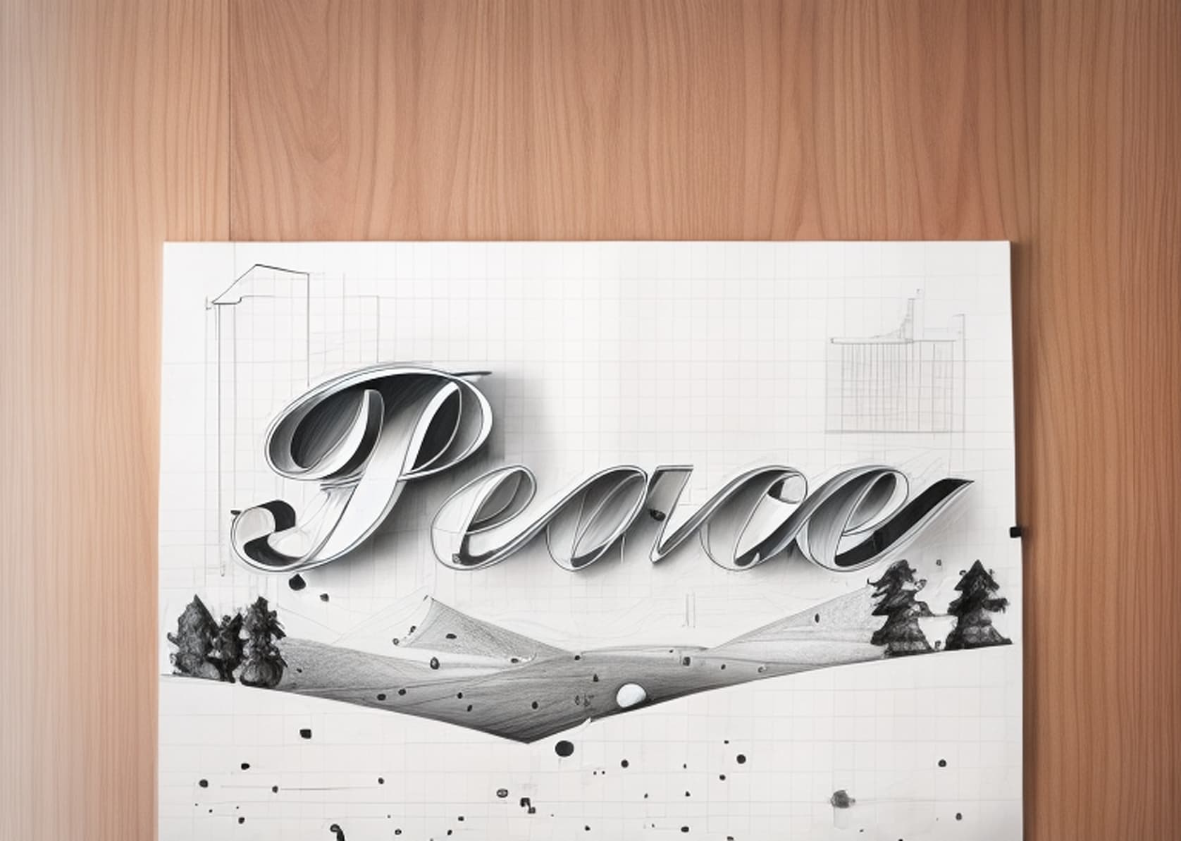
Off-label use of Diffusion–holiday greeting cards.
This year I wanted a subdued card with a one-word message: Peace. Image generation using AI is big now, so I asked Dall-E to create: “A winter landscape with trees and hills. The sky is gray, and it is snowing. Vector illustration with space for text.”
Then, using 3D Text in SketchUp, I created “Peace.” I imported the Dall-E image and made it a watermark overlay on the text. Here is the result:

For fun, I thought I would see what Diffusion did with it. The setting for ‘Respect Model Geometry’ was set to the max value of 1.5 for all the images below—I wanted to be able to read the word ‘Peace.’ Things start to get strange at a setting of 0.7 or less.
I thought I would share some results. Prompts, if used, are noted.
A plan for a better world? Style = Pencil sketch. Prompt = blueprint style. Prompt setting = 9
Bridging the urban/rural political divide in the U. S.? Style = Watercolor. No prompt.

We come in Peace? Style = Aerial masterplan. No Prompt.

A model for a happier world? Style = Clay model. No Prompt.

An illustrated Peace. Style = Illustration. Prompt = shades of blue, grey, and white only. Prompt Influence = 9.

Finally, a bit of fantasy. Style = none. Prompt = psychedelic. Prompt influence = 9.

Wishing you all a healthy, happy, and peaceful holiday season.
CarolynF
9 Likes
Using the preset watercolor prompt. I had other ones that I did not save, but I just started messing around with Diffusion today.


3 Likes
The elephant in the room, experimenting with the web interface for diffusion this morning and I have some confusing results. I have a simple model of an elephant, my only prompt is “photorealistic” , no style, and my respect model geometry set to 100 and prompt influence set to minimum. I was not expecting a rendered elephant, I think the AI has a pretty heavy interior design bias and won’t recognize an “elephant” but I was expecting to see some hint of the original shape, instead I get pictures of women’s faces. She does have grey eyes ![]() Am I missing something here?
Am I missing something here?

EDIT:
More interesting, exact same model and prompt yields a different result in SketchUp Pro interface??

4 Likes
A hairy mammoth cub? ![]()
3 Likes
An old fantasy about a timber structure, prompt “Finnish wooden church interior”


I wonder where it got the “sculpture” on the back wall from…
5 Likes
@endlessfix I’m not sure whether this may help to explain the different results you’re getting, but keep in mind that the inputs for Diffusion include your text prompt, style preset, settings, and whatever image is currently loaded in the preview pane.
I can see that there are other images of women’s faces in your list of results, if one of those other images were loaded into the preview pane when you clicked Generate, then the next set of images would offer an iteration of that image.
The reload button that is located in the top-right corner of the preview pane is there to offer a way for you to reload a fresh snapshot of what you see in the SketchUp model viewport.
3 Likes
This helps, I must have been confused about the recursive sampling without refreshing. ![]()
That is very interesting to know. Is that the same for the desktop?
It’s not yet.
Do you think it should be?
(we have a couple things that differ between the various platforms that we’re looking to collect feedback about)
I think that is something very useful and I think the Desktop version isn’t consistent in what the preview does.
The preview isn’t showing the image that is the base for the generation, the preview can’t be expanded, so it’s useless to focus an image there as the image is always what you have in SU viewport.
However, being able to iterate on the selected image, is a very useful approach as you could keep on steering the results.
Do you think I should say something about this in the other testing platform? Do you think it’s good enough to share this with you?
1 Like
We hear you ![]()
2 Likes
Hey folks! I find this tool fascinating. It’s obviously like watching a toddler take its first steps, but it’s absolutely fascinating. I wouldn’t say they are good for my clients, but who knows?
Does anyone know what prompt will get Diffusion to respect the color pallette of the design input?
I had to take the results into photoshop and recolor it.
Also, the edges are blurry/sketchy somehow. So I tried to clean that up with Pshop as well.
In the foreground of my test scene is an electric car charging station. I started with NO PROMPT I just clicked the Exterior Photorealistic preset button. Diffusion tried to turn the charging station into a person. Then in the prompt I added that there was an electric car charging station in the foreground and it stopped trying to make it look like a person.


1 Like
Yikes! We must be careful of what we say. We never know who’s listening!
1 Like
There’s no doubt that the best results I had, implied describing the image I was feeding Diffusion, in the best and simplest way possible.
This is especially true with spaces that are not expectable. I don’t know if this is the best way to define them, but if you have something like a barn, it’s expectable. If you do something in a post apocalypctic world it’s also something that the AI has references, but if you start mixing styles, or create unexpected spaces, or mixing unusual colors, you start getting unexpected results as the AI has no reference for that.
In the space above:
I had a huge trouble describing that the space above was actually an interior window for the double height dinning room. The AI was always trying to do that as something it had seen before. That window actually has an existing classical arched openning. It was very difficult to generate the image when the arch was visible.
This is how the project is at the moment:

What I have found right now, is that I think this particular space is nicely defined, even without prompt, and I wonder if that is because I’ve tried it before, a lot of times, or if it is because it has a lot more detail.

The suspended fireplace in the middle, is completely missing from the image. I’m sure it would have to be described, maybe even with it’s brand.
Eventually it got the fireplace right in a single render. Afterwards, it doesn’t show up again.
We would definetely need infill: Stroke/paint a mask in the preview window to make AI focus on the place you need while keeping the rest of the image.
Or the reverse as in this image, all is dark and nothing is right. I would like to copy paste the prompts that led me to the top interior space, while just add the fireplace and shelving system with cushioned bench.

5 Likes
Stable Diffussion is a text - to image generator, so the words are super important.
Being able to give it a base image is a bonus really.
2 Likes
The thing for me is that this is only interesting because of the ability to feed an image. AI generated images are not enough if I can’t feed a clearer idea. As architects we draw our ideas better than write them and that’s why drawings or models are the center of our work, even if we also need words to describe them.
Stable diffusion allows image to image generation and that’s what we’re probably using. It doesn’t feature devination powers yet, so we have to describe.
However, I would really like to leverage how we can accurately steer the generation.
What’s interesting about Stable Diffusion is exactly the way you can control output by having the following features:
- Inpaint
- Outpaint
- Material translation tables
- Sketch to image
- Area composition
- Seeds
If, in the future, Sketchup Diffusion could harness them, we would really be empowered to have more accuracy in our image generation.
1 Like
Here is a home that I designed and the 6 renderings created by AI. The prompts I used were:
“Photo-realistic rendering of mountain Craftsman home on wooded lot and long range mountains in the background, grass lawn, light-colored board-and-batten on garage dormer and front gables, natural cedar shakes on remainder of house, shingled roof, stone on column bases and front porch steps.”
I set it to the max for respecting model geometry and kept the prompt setting at the mid-point. I chose No Style. As you can see, it did a nice job of putting in the landscape and keeping the driveway in the right location on only 1 of the 6 renders. My main issues are:
1. On all the renderings I’ve seen on this model and (another yesterday), AI has a hard
time matching materials I’ve used on my Sketchup model. In many cases, the
materials are even bizarre.
2. In many cases, the straight lines in my model appear wavy or crooked in the renderings.
I’ve added a prompt, “retain straight lines” but it doesn’t seem to make any difference. This
is particularly apparent on roof lines, fascia, timber trusses, etc.
While I’m impressed initially with what Diffusion can do, I don’t think the renderings are good enough to show a client just yet. If I’m overlooking something in my prompts or otherwise, please tell me. I’m very eager to get it right as I think you’re definitely on the right path.

