Trying to make a specific type of sign

I’ve been experimenting, off and on, trying to make a Chevron station (a specific one from the Houston area). Because it’s off on a highway, the sign is tall and large (a smaller one exists on street level, but that’s a bit beside the point). Here’s the specific gas station I wanted to build: http:// www. oscarmail. net/ houstonfreeways/images/20140118-us290-clearance/20130500_290_0289_chevron.jpg

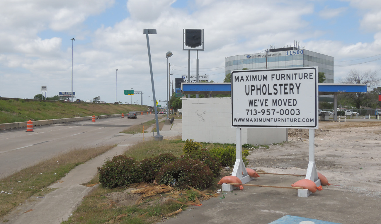
The sign isn’t specifically unique (at least to this one location), further down the road there’s a few more (these have since closed): http:// www. oscarmail.net/houstonfreeways/images/20140118-us290-clearance/20130407_290_009_maximum_furniture.jpg

These pictures aren’t mine, they are from the excellent Oscar (Erik) Slotboom, the page which you can see here:
http:// Houston US 290 Northwest Freeway right-of-way clearance

Unfortunately, I had a hard enough time trying to even line up some columns to make the base for the sign, and the sign structure has a distinctive shape to it, the way it holds the Chevron “shield”…that has to be done right.

I’m trying to see if I’m assembling it right…because trying to place a rectangle on top of my uniform tubes (in the pictures, they taper off) doesn’t seem right…

http://dl.dropboxusercontent.com/u/8243916/sku_chevron.png

One of the reasons I’d like to be as such is I want to someday use it in a game (SimCity 4 and/or its worthy successor). Can anyone help me out, or am I way over my head?

(EDIT: because I’m still classified as a new user, I can’t put in multiple links, so I’ve throttled the links, you’ll have to copy and paste, and remove the spaces. Sorry. :confused:

So after all that, what is it you are asking?

-Gully

how to model that →

Yeah, basically. I was trying to put in the links because a) people would know what I’m talking about and b) didn’t want to link raw photo links in there, I find that to be in poor taste

Yes, fine, I’ve looked at the picture. It’s not a very complicated structure. I wonder what kind of problems you’re having.

Are you saying you don’t have any idea how to proceed and someone needs to take you in tiny steps through the entire process, or are you asking specifically how to make a tapered cylinder or how to align objects? Or something else?

If you ask a specific question, you’ll get a specific answer. If you tell a vague narrative with no specific request, this is what you get, which so far is nothing in particular.

-Gully

heh, well, it took me about 5 minutes to figure out where all the spaces were in the link… i thnk i could’ve drawn the sign faster… was too burnt out to do anything after fiddling with the link though :sweat_smile:

2 Likes

I can make few comments about the fonts being used in the Chevron Sign. The overall sign shape seems to be fairly straight forward. But I think to really sell the thing, you have to accurately match the fonts that were used in the logo.

RE: THE OLD LOGO:

I’m not sure if there’s a matching font available for this version. Apparently that was an example of logotype where only the characters used in the logo were designed (and the rest of the alphabet was left undeveloped). CastleType was commissioned to complete the character set, but I’m not sure if they ever produced a usable font of the work they did. BUT, they do have a clean sample of it here… Font Services | CastleType which you can see if you wanted to reference that.


RE: THE MODERN CHEVRON LOGO:

The font used for the modern logo looks like it’s ‘Myraid Bold’… with the “h” being slightly altered – the top of it’s ascender has been angled off - from the original version.

If you’re on a Mac, you probably have this have this font installed already, and I think that it was also part of the default fonts which ship with Windows, but I can’t remember for sure.

for reference with this version see http://fontmeme.com/chevron-font/

I don’t know about the Mac, but on Windows the font is not part of the OS, but it comes with Adobe products (Acrobat, Photoshop, InDesign…).

Anssi

This is clearly the time to use an image, not match the font.

-Gully

2 Likes

Like Jeff said, modeling the sign isn’t too difficult, even for a beginner.
That is, if you’ll invest a modest amount of time learning SU’s native tools.
Here’s a good place to spend an afternoon … SketchUp Video Tutorials

These illustrate Gully’s suggestion. Projecting an image rather than modeling text.

Adding photos to faces — Aidan Chopra


Mapping photo textures to curved surfaces — Aidan Chopra

Edit:
Sorry @JimD … I hit the wrong Reply button.
My post is in reply to @pseudo3d

@ Gully

I wouldn’t say it’s clear at all. Using a photo texture would absolutely be easier, and it’s also a superior way to keep the entity count down to a minimum (which is often very important). But it does little towards creating a contoured surface that’s going to cast shadows in a realistic manner.

There are 2 signs at play here, one sitting on top of the poles, and the other projecting some 5” off the side of the roof structure. Using extruded text for the latter would be a good way of going. and I can’t think of anything easier than to use SketchUp’s 3d text options for this… especially if you can bypass having to draw your own contours in an attempt to match a font that’s already been created.

In any event, I wasn’t really trying to advocate for anything in particular, I just wanted to supply good source material for for what’s being used. . . As it was in real life with the Chevron corporation, and possibly in the model if pseudo3d decides to go that way.

Good point, @JimD. The sign along the edge of the marquee is a good candidate for extruded letters. Out of curiosity, I ran the image of the Chevron font through WhatTheFont? of the MyFonts site. Here are the results:

-Gully

Edit: It turns out that Verdana Bold, tweaked a bit, comes very close.

1 Like

Is there a reason for wanting a font? The canopy letters can be traced in about five minutes.

Shep

[SORRY FOR THE DELAY ON THIS - I had to look into a new SketchUp discovery I fell upon, and it looks like things weren’t what I thought they were]…


“Is their a reason for wanting a Font?”

Maybe, maybe not…

The best reason should have been because the font already has well drawn ‘vector based outlines’ for each character, and it would be hard to improve upon those by tracing a 2nd set of outlines over a rasterized image of the fonts original contours… with results differing by the resolution, and general quality of the image being traced.

My criticism is strictly towards the raster image, and the conversion process here… and not the guy doing the outlines on top of it. I’ve often scanned and outlined many details and profiles in order to get them into AutoCad so I could make block libraries of them, and thus preserve everything in a tidy digital format. And on every one of those scans and tracings, there was always some interpretation for fitting the outlines on the scanned image… It just happens, I didn’t do a bad job, it was just the nature of the conversion process, small distortions are built in no matter how careful you try to be, or what adjustments you might try to make concerning the resolution of the scanned image.

So the crux of the argument is of course one of accuracy, and trying to retain a faithful version of the delicate contours that typically make up any character/glyph. . . and this all sounds nice, and would have been my answer to the question mentioned above. But in SketchUp things don’t quite work out like this.

What I just realized is that the outlines which SU generates for its 3d text don’t have the same adjustability as normal curves do. The segment counts for them can’t be set any higher, and at their default level (whatever that is) the segment counts are rather low (ranging ~ 24—30 +/- as a guess).

So ultimately, and unfortunately ironic, I suppose it’s possible to get better results by tracing a font in SU, than by just inserting it in the normal fashion. At least with the manual tracing efforts segment counts can be increased to produce smoother curves. and that has the same benefit as it would to anyone who would prefer to see a 60 sided circle over one built with 24 sides.

I don’t think things should be like this, the font already has well defined contours in place (of a coveted vector nature), and if they could be more faithfully inserted into SketchUp (with adjustable segment counts), then I think there would be a significantly noticeable difference of quality when compared to other options.

But then that’s a matter for SU developers, and their list of priorities,… I haven’t exactly seen too many complaints about this. . . Though it would be nice, and it’s absence is a good opportunity lost. Hopefully this is easy to do, and I’d like to see it happen, but we’ll see.

fredo made a plugin called Curvizard that works well for smoothing 3D text or smoothing just about any curve in sketchup…
(extrusion at 0… no fill… select all the curved parts of the letters… curvizard → smoothing… make faces then push/pull)… this example is set to 3º smoothing… (ie- the largest angle of any given kink will be 3º)

(font = nobile bold: Nobile Font Free by Vernon Adams » Font Squirrel)

1 Like

Ahhh . . .

I’m going to like that one, Jeff!!

Thanks so much, for that.

Take Care,

Jim

Incidentally, to account for the two versions of the Chevron font we’ve seen, observe:


-Gully

1 Like

The segmentation is kept to a minimum for good reason.
Creating masses of tiny high-poly geometry will, sooner than later, bring your CPU to its knees.

The nodes are set in the ttf font template.


-Gully

Hi Gully,

I use FontLab Studio fairly often, mostly to design music fonts, however. But that will soon morph into a few experiments I have in mind regarding some stuff that’s specifically for SketchUp.

Anyhow, when you bring up the point of Node placements, Im not unfamiliar with the idea. But at the moment it’s not clear to me how SketchUp handles, or even interprets those nodes.

As an example… in FontLab, it would be a good practice to place the nodes at the outer most extremes of a contour… FontLab refers to this as ‘Nodes at Extremes’, which I’m sure you well know.

However fonts displayed inside of SketchUp don’t show any evidence of keeping these nodes in the so called ‘Extreme’ position… and it’s not uncommon for me to see flat line segments sitting in these position instead.

Anyhow, I’m just mentioning this because if you have any advice or other observations in this area. I’d certainly like know what they might be, at whatever level of detail you’re willing to share with me (maybe, us – but I’m not sure who else is interested in this topic).


Also, I don’t know if you’ve seen this or not, but FontLab has a new (free) app which they call ‘FontLab Pad’. . . http://new.fontlab.com/fontlab-pad/

I think it’s a pretty nice app, and I find very useful for matching up fonts, and making comparisons among other things. it has a transparent background mode which allows a complete overlay which is handy. and then you can also figure out what kerning value was used, as well as point size – but as far as the point size values go you need to use the up/down arrows on the keyboard to get incremental changes, they can’t be typed into the value field, or chosen from the pull down list (and this wasn’t apparent to me for some time)

Just want to mention that in case you, or others haven’t seen it yet, or might be interested.

I think Fontlab Pad has a potential use for certain SketchUp users who would want to use the picture approach which you’ve outlined above. On the occassions where the type isn’t so clear in the photo image. . . with this app you could figure out the best matching font already installed on your computer, get the sizing and kerning accurate, and then export your results as new image which you could then use to overlay the pixelated type that you might wat to change in the first place. But of course you’d have to do this by editing the image in another program, or whatever.

Anyhow, I just want to mention that in case it might matter to someone.

Take Care, and Thanks for all your good ideas,

Jim